Frequently Asked Questions
FAQ
UPDATED: Nov 17, 2025
Over time we've received many of the same questions via email or social
media. Hopefully if you've come to this page someone has asked your question
before! If not,
send us an email and we'll try to help you out.
General
When does the site typically update with new data each week?
(Updated Feb 15, 2023). Most free content on the website will be
updated sometime Monday morning during a normal week. The initial release times of paywalled content
for PGA and DP World Tour events will be listed at the top of the homepage on Monday.
The typical release time is 130pm ET. The "Tournament Props" and "3-Balls and Matchups" tools
are updated later, usually around 5pm and 730pm ET respectively.
For major championship weeks, the update schedule will likely be pushed up a bit as betting odds are released earlier.
What are your data sources?
As described below, most of the data used on our website is at the round-level (i.e. round
scores, and round-level strokes-gained in the categories). This data is
publicly available from a variety of websites that display results from
professional golf tournaments: e.g. pgatour.com,
owgr.com, wagr.com.
We also have a partnership with the PGA Tour that
gives us access to shot-level data from their ShotLink program. This data is not publicly available.
Is there a way to access your raw data? Do you have an API?
As of December 2020, we have an API!
Predictive Model
What is the difference between the two models listed on the finish probability pages?
Our default model is now one that includes course-specific adjusments: a golfer's
course history, course fit, and also course-specific residual variance. More details on these updates
to the model
can be found here.
On our pages this model is referred to as 'baseline + course history + fit'.
The other model referenced, the 'baseline', is described in detail
here. It does not take into account
the aforementioned course-player specific characteristics. The baseline skill estimates
are obtained by equally weighting golfers' historical performance
across all courses (but the weighting is not equal over time – recent results are weighted more).
We list both models for a couple of reasons. First, one way you could use
these models is to put more trust in a specific prediction when both models agree
(e.g. when both models show positive expected
value on the same bet). Second, the inclusion of both models gives a sense of how the
course history / course fit adjustments map to changes in finish probabilities. This should help
you build intuition about how changes in skill estimates (strokes-gained per round) impact the outcomes
we care about (i.e. finish probabilities).
Which model is used elsewhere on your site?
Unless otherwise noted, it is the full model (i.e. including course-specific adjustments)
that is used on the site.
Why do the finish probabilities change between their initial posting on Monday and
the start of the tournament on Thursday?
Any time there is an update to a field (for any of the events we cover: PGAT, DP World, LIV, KFT),
we re-run our model and generate updated finish probabilities. We also re-run when tee times are released
(typically some time on Tuesday for Thursday-start events) to account for differences in predicted
course conditions in the first two rounds (see Q&A below for more information on this).
These finish probabilities are produced through
a simulation exercise,
which means that even if the field is unchanged our estimated probabilities will be slightly different
with each run of the model. (We perform 60,000 simulations, which is large enough to eliminate any
large fluctuations in the probability estimates, but it can still be noticeable. For example, for a probability of 50%, an outlier (2 standard deviation)
simulation error would be 0.4%; for a probability of 10%, 2 SDs would be 0.24%). This "simulation error" is why a top player
can withdraw and yet some golfers see a slight decline in their, e.g., probability of finishing in the top 20.
For PGA Tour events with spots allocated to Monday qualifiers, we use dummy players with
the typical skill level of Monday qualifiers to run our simulations before Monday evening.
Once the qualifiers are known, we sub in the new players and remove the dummy golfers.
What do your predicted wave splits take into account?
When predicting wave splits — that is, the difference in scoring conditions between
the morning and afternoon waves — we mainly use historical data (and data from earlier rounds
in the current week after the tournament has started). We also incorporate weather conditions, both to adjust
historical scores and for predicting scoring conditions in future rounds.
Historically, the morning wave
on average faces a course that plays 0.15-0.20 strokes easier than the afternoon wave on Thursday, while that figure
increases to 0.25-0.30 on Friday. These will be the typical
wave split projections before making additional adjustments for weather; the Friday projection
is also impacted slightly by how the course played on Thursday in the morning versus afternoon.
Pre-tournament we also provide the predicted wave split over the first two rounds for the Thursday morning wave ("Early-Late") versus the Thursday afternoon wave ("Late-Early"). Historical data from both the European Tour and PGA Tour indicates that the Late-Early wave on average has a 0.1 stroke advantage over the Early-Late wave (this advantage remains after accounting for any skill differences between the waves). You can speculate as to why that may be the case. Therefore with no information on weather, this is the typical value for our weeklong projected wave split. On weeks and rounds where there are not clearly defined waves (e.g. limited-field events, multi-course events) we don't predict splits.
Finally, let's clarify the interpretation of our wave split notes. If it is a morning/afternoon split prediction for a given round, the listed advantage (in strokes, or fantasy points) indicates how much easier we think the course will play for morning wave that day. If the listed number is negative, that indicates that we expect the morning to play more difficult than the afternoon. The same interpretation applies to notes on the weeklong split, except now we are comparing expected scoring conditions for the Thursday morning wave to the Thursday afteroon wave over their first 2 rounds.
In simple terms, what does your predictive model take into account?
If you would like a detailed (and up-to-date) description of the model methodology, visit this
blog post.
The model uses historical data from any OWGR-sanctioned events (plus LIV) and a very comprehensive database of amateur events that includes most American college golf events, and any event that is included in the World Amateur Golf Rankings.
Using this historical database, the model produces estimates of each golfer's expected strokes-gained relative to an average PGA Tour professional (update: we've made our SG baseline tour-independent). To obtain these estimates there are basically just two steps: 1) properly adjusting scores across tournaments and tours (e.g. accounting for the fact that beating fields by 2 strokes on the PGA Tour is better than doing so on the European Tour), and 2) producing a weighted average of these adjusted scores to project future performance (more recent rounds recieve more weight). With these predicted strokes-gained estimates we can then derive any outcome of a golf tournament we would like: e.g. a Top 20 finish probability, or a head-to-head matchup win probability.
This last point is important: once we have our skill estimates for each player (in units of strokes-gained relative to an average PGA Tour professional), we can translate skill differences into probabilities (of various sorts). This depends critically on how much random variance in performance there is in golf. Dig deeper into this here.
The inputs to our model only include round-level information (i.e. no hole-level or shot-level data is used). (update: this is not true anymore.) We do incorporate round-level strokes-gained category performance (e.g. Off-the-tee, Approach, etc.) where it is possible. This latter adjustment makes use of the fact that long game performance is more predictive than short game performance.
Importantly, our model does not account for course-specific characteristics. (update: This is now true only in the baseline model — we have moved to a model that includes course-specific adjustments as the default model.) For reference, a golfer's last 150 rounds (roughly) contribute to the estimate of their current ability level.
How should I make use of your model's output?
To make use of our model, you first need to understand what it is
good at. Our model provides a set of baseline estimates that likely do not
warrant big deviations from. We are confident in saying that our model's output gets you most of
the way to accurate predictions. The majority of the value-added of our model
likely lies in two areas: first,
we are missing very little relevant data on golfers' recent performance.
There are several models out there that are only using PGA Tour data; this immediately
puts those models at a large disadvantage. Second, we are properly
adjusting scores across tours; being able to directly compare performance
across professional tours that differ drastically in quality is very important.
Doing these two things well gets you most of the way to obtaining good estimates
of golfer ability.
Our estimates are not perfect, however. As said above, currently we do not account for any course-and-player specific effects. This would include, for example, certain players performing better on certain types of course layouts. In our past work, we have found course-and-player-specific characteristics to be difficult to incorporate into the model in a systematic manner. We are always working to improve the model, so course history and course fit may be incorporated soon; this page will be updated when it is. (update: This is true only in the baseline model — we now provide estimates from a model that includes course history and course fit.)
Apart from just using our model's output directly, there are a couple of ways you could incorporate your own information with our model's output. First, it could be useful to take our estimates as a baseline and make manual tweaks when there are particularly strong indications of player-course fit (e.g. Luke Donald at Harbour Town, Phil Mickelson at Augusta National). These adjustments should never be too large in our opinion (work we have done shows that course fit does not have much predictive power). Second, if you have your own predictive model, combining (e.g. taking a simple average, or a weighted average) our estimates with yours is one possible strategy to produce an even more accurate model than either model alone.
In the near future, we will be providing Scratch subscribers with the ability to download our model's estimates of player skill (i.e. expected strokes-gained per round) which will make it easy to incorporate our model's output into models of your own. We also plan to work on other ways that allow subscribers to customize our model's predictions (e.g. allowing users to tweak skill estimates in terms of strokes-gained per round, and then translating those tweaks into relevant probabilities for weeklong finish position and head-to-head matchups). Look for these features to be live in the near future.
Data Golf Rankings
What are the Data Golf Rankings?
The Data Golf Rankings
are our rankings of the best golfers in the world. Any golfer
that plays in OWGR-sanctioned events, LIV events, or
WAGR-sanctioned
amateur events is eligible. The rankings are determined by averaging the
field strength-adjusted scores
of each golfer, with recent rounds receiving more weight. The index listed on
the page—the DG Index—is this weighted average (plus some adjustments for the overall recency of a player's data),
and should be interpreted as our expectation
for a golfer's next performance in units of strokes-gained relative to an average
PGA Tour field (update: we've made our SG baseline tour-independent).
That is, if a player has a value for the DG Index of +2, that means we currently expect them to beat
a PGA Tour field by 2 strokes per round. Approximately the last 150 rounds that a golfer has played
contribute to their DG Index.
Finally, to be included in the rankings, a golfer must have played
at least 40 rounds in the last 2 years and at least 1 round in the last 6 months.
What are the Data Golf Amateur Rankings?
The Data Golf Amateur Rankings
are our rankings of the best amateur golfers in the world. The rankings are
based off the same DG Index described in the answer above this; the only difference is that we report
the DG index as strokes-gained relative to the average golfer in the Division 1 NCAA Championship, which we
estimate to be about 2.3 strokes worse per round than an average PGA Tour field. Therefore an amateur golfer
with a DG index of +3 would be expected to beat the D1 NCAA Championship field by 3 strokes per round,
and a PGA Tour field by 0.7 strokes per round.
The data used to form the rankings includes any US college event that is listed on
Golfstat, any WAGR-sanctioned events, and any professional events
that amateurs happen to play in. To be eligible for the amateur rankings, a golfer must be an amateur (wait, what?!), and have
played at least 20 rounds in the last 2 years and at least 1 round in the previous 12 months. If you want to understand
more about the true strokes-gained metric that powers these rankings, and how our rankings compare to those of the WAGR,
check out this blog.
What is a golfer's skill level?
A golfer's skill level at any given point in time is their expected performance
(according to our model) in their next round. Golfer skill is in units of strokes-gained per round
relative to an average PGA Tour field at an average PGA Tour course.
We also sometimes refer to this as a golfer's ability.
The word "expected" here is important.
Different estimates
of skill can be formed depending on what goes in to that expectation.
For example, the Data Golf Rankings
are based off skill estimates that only use total strokes-gained as inputs (we call these skill estimates
the DG Index). Conversely, in the model that is used to generate our weekly predictions,
we draw on as much information as possible when forming our estimates of skill (e.g.
strokes-gained category performance). This
Q&A provides more information on this
difference.
How are the different components of skill on the
skill ratings page estimated?
Just as with a golfer's overall skill level, our predictions of skill in the strokes-gained
categories, or for driving distance or driving accuracy, should be interpreted as
an expectation (or prediction) of a golfer's next performance in that specific
skill at an average PGA Tour course. For example, a skill estimate of +0.4 in strokes-gained putting
means that we would expect that golfer to gain 0.4 strokes on the greens over an average PGA Tour field in their
next round (again, at an average PGA Tour course). For driving distance the units are yards-gained
relative to an average PGA Tour field, while for driving accuracy the units are in
percentage of fairways hit relative to an average PGA Tour field. (See
examples here for more clarity on this.)
Next, some details on how these specific skill estimates are actually formed. These are estimated in a similar fashion to our overall skill estimates, e.g. the estimate of driving distance skill is mostly driven by historical driving distance, with recent data receiving more weight. (You can read more about this in our model methodology blog post.) For various technical reasons, the main one being that not all golf tournaments provide detailed SG data, the sum of our skill estimates for SG:OTT, SG:APP, SG:ARG, and SG:PUTT will not necessarily add up to our overall estimate of a player's skill. Therefore, we calculate this discrepancy and adjust the category SG estimates so their sum matches the overall skill of a player. The difference is distributed unevenly to the SG categories, with more of it going to OTT and APP skill as they vary more than ARG or PUTT skill. That is, if the sum of our SG estimates is 0.2 strokes lower than our overall skill estimate, 70% of that (or .14 strokes) might be allocated to OTT and APP skill, while the remaining 0.06 strokes would be added to ARG or PUTT.
Next, some details on how these specific skill estimates are actually formed. These are estimated in a similar fashion to our overall skill estimates, e.g. the estimate of driving distance skill is mostly driven by historical driving distance, with recent data receiving more weight. (You can read more about this in our model methodology blog post.) For various technical reasons, the main one being that not all golf tournaments provide detailed SG data, the sum of our skill estimates for SG:OTT, SG:APP, SG:ARG, and SG:PUTT will not necessarily add up to our overall estimate of a player's skill. Therefore, we calculate this discrepancy and adjust the category SG estimates so their sum matches the overall skill of a player. The difference is distributed unevenly to the SG categories, with more of it going to OTT and APP skill as they vary more than ARG or PUTT skill. That is, if the sum of our SG estimates is 0.2 strokes lower than our overall skill estimate, 70% of that (or .14 strokes) might be allocated to OTT and APP skill, while the remaining 0.06 strokes would be added to ARG or PUTT.
What is different between the skill estimates
listed in the Data Golf Rankings and
the skill estimates shown on the skill ratings page?
There are several differences between the skill estimates listed on the
rankings page
and those
shown on the skill ratings page.
The former only take
into account a player's past performance in terms of total strokes-gained (adjusted for field strength).
We do this because we believe rankings should solely reflect the quality of a golfer's
historical performance, which in golf is defined
by total strokes-gained. The latter make use of other data with the aim of
improving predictive power; for example,
a golfer's past performance by strokes-gained category. The full set of
adjustments can be seen on the skill
decomposition page by looking at the columns to the left of "course history".
(The 'baseline' column on this page contains the (approximate) estimates used to generate the DG rankings.)
The skill estimates used in our full model to generate weekly predictions
are equal to the estimates on the skill ratings page plus some
course-specific adjustments.
(update: starting in 2024, the "TIMING" column on the skill decomp page also contains
adjustments for
when a player last played; these are not included in the skill ratings estimates.)
Betting Tools
General
What is expected value? How do I interpret expected value as it's shown on the betting tools?
When rolling a 6-sided die, the expected value of the side that lands face up is 3.5. That is, if you were to roll
the die many times and compute the average, it should approximately equal 3.5 (and with enough rolls, it will equal
exactly 3.5). More generally, expected value is simply the average outcome from a large number of realizations
of some random process (e.g. rolling a die).
On our betting tools, we show the expected value from making a 1-unit bet (a unit can be anything you want: $1, $50, etc). If expected value is 0.12, this means you can expect to profit 0.12 units on that specific bet. Of course you will either win or lose that bet, but if you make many bets with an expected value of 0.12, then on average your profit should be 0.12 units per bet.
Our estimates of expected value come from our predictive model; see the Q&A directly below for more general information on the calculation of expected value. For the specifics behind the EV calculations on the finish tool, see this Q&A, and for the matchup tool calculations see this Q&A. Because our model is not perfect, the listed expected value is very likely higher than true expected value. See this Q&A for more information on this. As a rough rule, for matchup and 3-ball bets you probably should only place a bet if our model's expected value is 0.05 or higher; for outrights and finish position bets, that threshold should be closer to 0.1 or 0.15 (the longer are the odds, the more sensitive is our expected value calculation).
I'm new to betting; how do I use the information on your betting tools?
The betting tools allow you to (hopefully) make value bets. A value bet is one where the 'true' probability of
winning the bet is greater than the probability implied by the bookmaker's odds. On both the Scratch
finish tool and
matchup tool, the bets to look for are those
with expected values greater than zero (the green-shaded squares). If a bet has positive expected value,
this means that, on average, you will profit from making the bet. Of course, this doesn't guarantee you a
profit on that specific bet because the outcome is a random event, but, if our model is accurate, making many
positive expected value bets will secure a long-term profit.
Let's break this down further for those who want to understand things in more detail. First, expected value on a simple bet of 1 unit is equal to p * euro_odds - 1, where p is the probability of winning the bet, and euro_odds are the odds (in decimal format) offered by the bookmaker. The 'probability implied by the bookmaker's offered odds' is defined as the probability required to earn an expected profit of 0; if you set the expected value formula above equal to 0 and re-arrange, you can see that p must be equal to 1/euro_odds for expected value to be 0. (Use an odds convertor tool to learn how to switch between American odds, European odds, and implied probabilities.) If you are able to determine that the 'true' probability of winning a bet is greater than this implied probability (1/euro_odds), then that bet will be a positive expected value proposition for you! Therefore, all of the work in value betting revolves around accurately estimating the probability of certain outcomes occurring. For us, our best estimates of 'true' probabilities come from our predictive model; these are listed on the Scratch tools under the 'DG' header. As should be clear from the discussion above, whenever the DG probability is greater than the bookmaker's implied probability, the bet will be positive expected value and, in theory, worth taking. On the Scratch pages, and elsewhere on the site, you always have the option (at the top right of the page) to change the odds format; these are simply different ways of conveying the same information. If you choose American or European as the odds format, positive expected value bets will now be the ones where DG odds are lower than the bookmaker odds.
To hammer home the points made so far with respect to value betting, consider the classic example of betting on coin flips (which, really, is not so different from betting on golf). We know that the probability of flipping Heads or Tails is equal to 50%. Suppose a bookmaker offers European odds of 2.0 for Heads (i.e. +100 American odds); this implies a probability of 1/2 = 50%. Therefore, given that this implied probability is equal to the true probability of Heads, the expected value from betting on Heads will be zero. If a bookmaker offered odds of 1.9, the expected value would be negative (-5%, or -0.05 per unit bet); if a (foolish) bookmaker offered odds of 2.1, the expected value would then be positive (+5%), and hence be a bet worth taking.
What are dead-heat rules?
The simplest bet types are those where you receive a payout equal to the offered odds if you win, and receive nothing otherwise.
This payout structure exists for matchup bets where a separate bet for a tie is offered, for example.
However, for bets on finish positions (e.g. to finish in the Top 20), for 3-balls, and
for some other bet types, 'dead-heat' rules typically apply. These rules specify the payout
in the event of ties between golfers. In a 3-ball, if there is a tie
for low score (between 2, or all 3, of the golfers), the payout you receive will be
divided by the number of golfers involved in the tie; if you bet 1 unit on golfer
A at European odds of 4.0, and there is a 3-way tie in the 3-ball, your payout will be equal to 4/3, for a profit
of 4/3 - 1 = 0.33 units. For finish position bets, the same logic applies: if 2 golfers tie for 20th place
the payout will be halved; if 7 golfers tied for 17th place, the payout would be equal to 4/7 of the full bet.
More generally, the fraction to be paid out is equal to (number_of_positions_paid)/(number_of_golfers_tied).
The expected value calculations in the Scratch Tools for 3-balls and finish position bets take into
account dead-heat rules.
Custom Simulator
How frequently is this tool updated and what is changing on update?
The custom simulator is updated with new data every evening, as indicated by
the time stamp at the top of the page. The updated data includes our most
recent estimates of player skill. For matchups involving players in the same
event that week, the simulation data comes directly from our
pre-tournament
simulations (if the event has yet to start) or from our
live model
(if the event is underway) —
this means everything that our live
model takes into account is accounted for
in the custom sim probabilities.
Where do these probabilities come from? Why do they sometimes differ slightly each time a simulation is run?
When the selected golfers are both in an event that is being played in the current week,
the probabilities are obtained from a set of simulations that we have already run (either
from our pre-tournament predictions or from our live model predictions, depending where
we are in the week). These probabilities will not change from one run to the next.
However, if the selected golfers are not playing in the same event or aren't playing at all in the current week,
the win (and tie) probabilities are obtained by running 60k simulations;
because each simulation is a random event,
there will be small differences in our probability estimates
on each run. This 'simulation error' from running only 60k sims is small enough to be safely ignored.
How do you incorporate the cut into your 4-round matchup simulation?
For golfers in an event in the current week,
the cut and any other feature of an event is already built into the simulations that
we use to calculate the probabilities (see Q&A directly above).
If you select 2 players that are not competing in the same
event that week, or aren't competing at all, you will recieve a notice that we are
using a default cut rule (which is total strokes-gained of 0 through 2 rounds).
This means that, when we simulate, if a golfer's first 2 rounds sum to less than
zero they 'miss the cut' in that simulation.
Which model is being used to simulate?
If the selected players are playing in the same tournament in the current week,
the model with course-specific adjustments is used. Otherwise, the baseline model
is used (which accounts for strokes-gained category performance, but not course specifics).
A message is displayed beneath the listed probabilities indicating which model
is in use.
Finish Tool
How are you calculating expected value for the finish position bets?
Dead-heat rules apply to finish position bets at (nearly) all bookmakers,
therefore the probabilities we display account for dead-heat rules.
As a consequence, expected value can be calculated using the simple formula of
p * euro_odds - 1 where p is the listed Data Golf probability and euro_odds
are the bookmaker's odds in decimal, or European, format (i.e. odds of 3.0 means a 1-unit winning bet returns
3 units for a profit of 2). The sum of the field's Data Golf Top 20 probabilities will add up to 20,
their Top 5 probabilities will add up to 5, etc, as should be the case when
dead-heat rules are being applied to payouts.
How are you calculating expected value for the each-way bets?
For each-ways, half of your bet is placed on the "to win" bet at the listed odds, while the other half is placed
on a "top X" finish position bet at odds that are calculated using the listed each-way fraction. For example, if the terms are
"1-5, 1/4", this means that the finish position portion of the bet is for a top 5 finish at odds that pay out 1/4 of the
profit of the win bet. This last bit is important: using decimal odds,
you apply the each-way fraction to the win odds minus 1 (i.e. the profit from a winning bet),
and then add 1 back on at the end to return to decimal format. For example, if the win odds are 51,
the top 5 decimal odds (using 1/4) will be (51-1)/4 + 1 = 13.5. With these odds in hand, to calculate the overall EV of a 1-unit each-way bet we simply
take the average of the simple expected value calculation (as described in the Q&A above this) for the win bet and the finish position bet.
If you are trying to calculate the expected value for each-ways at a book that we don't cover, or using terms that aren't shown on our finish tool, you can access any DG probability from 1st-50th using the dropdown on the right side of our prediction pages, or by using the model predictions endpoint in the API.
If you are trying to calculate the expected value for each-ways at a book that we don't cover, or using terms that aren't shown on our finish tool, you can access any DG probability from 1st-50th using the dropdown on the right side of our prediction pages, or by using the model predictions endpoint in the API.
How is a bookmaker's "hold" calculated?
A book's "hold" is their theoretical profit per dollar bet. All else equal, a bettor can
expect to earn worse returns betting against a higher hold. For a 2-way market with odds of 1.9 on both
sides, hold is calculated by first summing the two implied probabilities, which yields 1.0526, and
then subtracting 1 from this sum and dividing by the sum, which gives a value of 5%. More generally, for markets with
many possible outcomes but only a single winner, hold is calculated as (sum_implied_probs - 1)/sum_implied_probs.
For markets with multiple "winners" (e.g. Top 5 market), hold is calculated as
(sum_implied_probs - places_paid)/sum_implied_probs. For example, suppose a bookmaker's implied probabilities
for their Top 5 odds
add up to 6.2; their hold is then equal to (6.2-5)/6.2 = 19.4%.
In outright and finish position markets, it is common for bookmakers to not offer odds on the full field. In these cases, instead of subtracting the number of places paid (e.g. 5 for Top 5 markets, 1 for Outright markets, etc), we subtract the sum of the Data Golf probabilities for the offered players. For example, if only half the players in an outright market are priced by a book, their implied probabilities might add up to 0.85; if the Data Golf probabilities for these golfers add up to 0.7, hold would equal 17.6%. Essentially we are using the Data Golf probabilities as fair odds here. For the most part this should not introduce any systematic bias, but there will be cases where this calculation does not function as intended. For example, Bet365 usually only offers Make/Miss Cut bets for the top half of the field; because they don't seem to correctly adjust their odds for different field compositions, there can be weeks where our calculated hold for Bet365 missed cut bets is negative. The intuition here is simple: relative to our model probabilities (which we are using as fair odds) Bet365 Missed Cut odds on the tournament favourites are too long, so much so that betting randomly into this market will yield a profit (again, assuming our odds can be used as fair prices).
A couple more notes for those who are interested. Hold is the theoretical profit per dollar bet because it only equals realized profit if the the bookmaker balances their book. For a 2-way market with odds of 1.9 on both sides, this requires that even amounts of money are bet on either side. More generally, the money wagered on each bet needs to be proportional to the offered odds (e.g. in a 2-way market with odds of 3 and 1.3, the book would require a 30/70 split to ensure they earn a profit equal to their hold of ~9%). Finally, it seems possible that bookmakers who don't offer complete odds may have mechanically lower or higher holds depending on who they offer odds for (e.g. favorites or longshots). However, in our analysis we have found that bookmakers (surprisingly) apply their margin roughly proportionally (i.e. there is no fav-longshot bias), which means that regardless of who they are offering odds on we should be able to accurately estimate their hold. Relatedly, if the bookmaker is applying their margin proportionally, hold will also equal the bettor's rate of loss if they bet randomly into the market.
Matchup Tool
What model is being used to generate the matchup probabilities?
The matchups page
uses the model
with course-specific adjustments (as of Jan 1, 2020).
How are you calculating expected value for the different matchup formats and 3-balls?
For a simple bet where there are only 2 possible outcomes (win the bet; lose the bet), expected value on a 1 unit bet is equal
to p * euro_odds - 1, where p is the bet win probability (which comes from our model) and euro_odds, also known as
decimal odds,
indicate the payout you receive for winning your bet (e.g. if you
bet 1 unit at odds of 3.0, a winning bet returns 3 units for a profit of 2 units).
This expected value calculation applies to tournament matchups, round matchups, and 2-balls where a separate bet is offered for a tie; on our matchup tool, the tie rules are always listed at the top of the table as they vary across bookmakers. For these bets, the bet win probability, p, is the probability of the golfer winning outright (i.e. by 1 stroke or more).
For 3-balls, dead-heat rules apply. The expected value calculation for these bets is a little more complicated but still fairly straightforward; we estimate the probability of each golfer winning outright, of each 2-way tie between golfers, and of a 3-way tie, and then apply the relevant payouts using dead-heat rules. Alternatively, we can calculate a probability that accounts for dead-heat rules; with this probability in hand, we can again use the formula of p_dh * euro_odds - 1, where p_dh is win probability that accounts for dead-heat rules. On the matchup tool it is this probability that we display, as it can be directly compared to the bookmaker's odds to assess expected value.
Finally, for bets where ties are void (these can be tournament matchups, round matchups, or 2-balls), meaning that if the bet results in a tie you have your bet returned, expected value is equal to p_win * (euro_odds - 1) - p_loss, where p_win is the probability of the golfer winning outright, and p_loss is the probability of the golfer losing outright. (Note that p_win + p_loss + p_tie = 1). When we display our probabilities on the matchup page for these bet types we show p_win/(p_win + p_loss); this is so that our probabilities can be directly compared to the implied probabilities from bookmakers (1/euro_odds). For example, suppose we predicted a matchup between golfer A and golfer B to have outcome probabilities of: A wins with probability 30%, B wins with probability 61%, and they tie with probability 9%. Expected value from betting on A at odds of 2.8 would be equal to 0.3 * (2.8-1) - 0.61 = -0.07. On our matchup betting tool, we would list the win probability for A as 0.3/(0.3 + 0.61) = 32.97% and for B as 67.03%. You can check that expected value will be positive on A whenever the implied probability from the bookmaker is less than 32.97%. (As an aside for the true grinders.. some people seem to like to calculate EV on this bet as 0.3297 * 2.8 - 1 = -0.077; in my opinion this is incorrect, as ties are one of the possible outcomes and so should be factored into the expected value calcuation. In the end, it doesn't really matter as in both EV calculations the flipping point from (+) to (-) occurs at the same odds, 3.033 in this case.)
Tournament Props
Why do the matchup probabilities from the tournament props page differ from those in the custom simulator?
The simulator on the Tournament Props page is meant for simulations
involving 3 or more golfers. Therefore, dead-heat rules are
applied when calculating the probability. This will, in general,
be different from the win probabilities you estimate after throwing out ties (which people do when
ties are void on a bet). For example, at the 2021 Sony Open we estimated that a 4-round matchup between
Joseph Bramlett and Webb Simpson had outcome probabilities of 17.6% (Bramlett win), 79.4% (Simpson win),
and 2.9% (tie). With ties void, the win probabilities become 18.1% and and 81.9%. With ties as dead-heats,
the win probabilities become (17.6% + 2.9%/2) = 19.1% and 80.9%. The latter is what will show up on the
Props tools.
True Strokes-Gained
What is "true" strokes-gained?
True strokes-gained is simply raw strokes-gained — the number of strokes you beat
the field by in a given round — adjusted for the strength of that field. If the average golfer in field A
is 1 stroke better than in field B, then beating field A by 1 stroke and beating field B by 2 strokes would yield
equal true strokes-gained values. As with regular strokes-gained, true
strokes-gained requires a benchmark. For this we use the average performance in PGA Tour events in a given
season (update: we've made our SG baseline tour-independent).
(That is, the average true strokes-gained for all PGA Tour rounds in a season
is zero.) Therefore, you would interpret a true strokes-gained number from a round in the 2018 season
as the number of strokes better than the performance we would expect
from the average 2018 PGA Tour field. Note that, throughout the site, slightly different wordings
are used to describe the true strokes-gained benchmark — e.g. average PGA Tour player, average PGA Tour field
— they are all meant to describe the same benchmark, which is the average performance in PGA Tour events.
Importantly, this interpretation
holds for performances across all the tours in our data — for example, the average true strokes-gained
performance on the 2018 Mackenzie Tour was about -2.5 strokes per round. This is, after all, the purpose of the
true strokes-gained metric: having a measure of performance that can be directly compared
across all tournaments and tours.
Because the benchmark is unique to each season, we are not taking a stand on how the average skill level of the PGA Tour is changing over time. This "true" adjustment is also applied to each of the strokes-gained categories, and the interpretation is the same (i.e. performance in that category relative to the average PGA Tour performance in the relevant season).
Because the benchmark is unique to each season, we are not taking a stand on how the average skill level of the PGA Tour is changing over time. This "true" adjustment is also applied to each of the strokes-gained categories, and the interpretation is the same (i.e. performance in that category relative to the average PGA Tour performance in the relevant season).
How can you estimate a player's performance relative to the typical PGA Tour player for tournaments other than those on the PGA Tour?
It is possible to make comparisons of performances on, for example, the Web.com Tour to those
on the PGA Tour because there is overlapping golfers in these fields. That is, each week in the Web.com event
there will very likely be a few golfers who played in a PGA Tour event in the weeks preceeding or following it. It is due to this
overlap that direct comparisons are made possible across tournaments and tours. For example, if a player
beats a PGA Tour field by 1 stroke per round one week, and then beats a Web.com field by 2 strokes
per round the next, we could conclude that this PGA Tour field is 1 stroke better per round than
this Web.com field (if we assume the player's ability was constant across the 2 weeks).
Of course this example doesn't seem very realistic because we are ignoring the role of statistical
noise: what if the player played "poorly" one week? This would lead us to draw misleading
conclusions about the relative field strengths. This is mitigated in practice by the
fact that we don't have just one player "connecting" fields, but many.
But what about tours like the Mackenzie Tour or Latinoamerica Tour — surely there is very little overlap between these tours and the PGA Tour in a given season? This is true, but to make comparisons of the Mackenzie Tour to the PGA Tour we don't actually need direct overlap. It is sufficient that there are players from the Mackenzie Tour events who also play in Web.com events, and then there are some (different) players in the Web.com events that also play in the PGA Tour events. It is in this sense that we require Mackenzie Tour events to be "connected" to PGA Tour events. The accuracy of this method is limited by the amount of overlap across tours and fields; in general, we find there is a lot more overlap than you might expect. Now that we have recently expanded our database of golf scores to include any event played on an OWGR-sanctioned tour as well as any event included in the World Amateur Golf Rankings, there are many ways that PGA Tour events can be connected to other, smaller, tours.
Once we run this statistical exercise, we are left with a set of strokes-gained numbers that can be compared relative to one another. But, we would like to have a useful benchmark to easily understand the quality of any single performance in isolation. Therefore, as said above, for each season we make the average true strokes-gained performance equal to 0 on the PGA Tour (update: we've made our SG baseline tour-independent). This gives us the nice interpretation for all true strokes-gained numbers as the number of strokes gained relative to the average PGA Tour field in that season.
On the true strokes-gained page, why don't the strokes-gained
categories add up to strokes-gained total in the yearly summary tables?
Only events that have the ShotLink system set up provide data on player performance
in the strokes-gained categories. Therefore, the true strokes-gained numbers in each
category are derived from this subset of events, while the true strokes-gained total
numbers are derived from all events in our data (PGA Tour, European Tour, Web.com, etc.).
If every tournament a golfer played in a given season had the ShotLink system in place,
then the sum of the true SG categories will equal true SG total.
On the true strokes-gained page, why do you have to
impute some of the strokes-gained category values?
Imputation is only necessary for some — but really most — European Tour events.
The Euro Tour started tracking strokes-gained category data in late 2017. On their website they only make available event-level
strokes-gained averages rather than the raw round-level data (unless you pull the data immediately after each round is played,
which has its problems as there are often data errors). For the (few) European Tour events where we have successfully collected the round-level data for each
SG category, we obviously just display that. (It's also worth noting here that the SG category
data from the Euro Tour is typically missing for a few players in each event.) In the other events where only event averages are available,
we have to get creative.
For the purposes of incorporating this data into our predictive model this is not a big issue;
ideally we would like to know the values for individual rounds as more weight is applied to more recent rounds, but using the same value for
all rounds played within an event only changes things slightly. However, given the information we have — event-level strokes-gained
category averages and total strokes-gained for each round — we can actually do a bit better than just using event averages.
We fit a regression model using PGA Tour data (where we actually have round-level strokes-gained) to estimate the relationship between the relevant
variables (i.e. use event-level SG category averages and total SG in a round to predict the SG category values for that round). We can then use that model
to predict (i.e. impute) our missing round-level data on the European Tour (with the obvious caveat that we are assuming this relationship is
similar on the PGA and European Tours). A few notes on these imputed values: they will add up to the actual event-level averages in each category; they
will show less variation than the true (unobserved to us) round-level data; and the imputed values for putting and
approach will vary more than off-the-tee and around-the-green.
That is, if a golfer gained (in total) 5 strokes more in round 2 than round 1, more of that difference will be attributed to strokes-gained approach and putting than
to off-the-tee and around-the-green. These imputed values will only make a difference in the true SG query tool
if you select a sample (e.g. last 50 rounds, last 3 months) that falls in the middle of an event that uses imputed data.
Why is true
strokes-gained not exactly equal to raw strokes-gained plus your
estimates of the field's
average player quality?
Hello, interested reader! Welcome to
the weeds.
In a perfect world, true strokes-gained as it appears on our website would be equal to raw strokes-gained (i.e. a golfer's score minus the field's average score) plus field strength as it appears on this page. However, this is not quite true for two reasons. The first reason is fairly innocuous: our field strength page shows the average skill level for the players in round 1 of a tournament. Therefore, for rounds played after a cut is imposed on the field, the average skill level will differ slightly from that listed. The second reason is more technical, and accounts for why even round 1 true SG values will differ from raw SG plus the field's listed strength. The issue is that to estimate true strokes-gained, we require estimates of players' skill; but, to estimate a player's skill, we require true strokes-gained! In theory, we could perform our entire estimation procedure in a big loop, and stop once our estimates of player skill converge from one iteration to the next, but this would be very computationally expensive and result in marginal gains. Therefore, the problem is this: the measures of field strength used when estimating true strokes-gained are ultimately not the same as those that appear on the field strength page. The details of the strokes-gained adjustment are here. One good reason to keep things as they are now, is that the field strength measures estimated in the score adjustment method use data from both before and after a tournament. That is, when we retroactively estimate true strokes-gained values for the 2020 Travelers Championship (as we do every week), the fact that Scottie Scheffler played very well after that tournament increases the field strength (and hence the true SG values) compared to what our estimate was the week immediately following the Travelers. In contrast, field strength as estimated in our predictive model only uses data from before an event is played, as, naturally, that is all we have when making predictions! (And these are the values that are displayed on the field strength page.) In general, these two measures of field strength should be very similar (within 0.1-0.2 strokes of each other).
In a perfect world, true strokes-gained as it appears on our website would be equal to raw strokes-gained (i.e. a golfer's score minus the field's average score) plus field strength as it appears on this page. However, this is not quite true for two reasons. The first reason is fairly innocuous: our field strength page shows the average skill level for the players in round 1 of a tournament. Therefore, for rounds played after a cut is imposed on the field, the average skill level will differ slightly from that listed. The second reason is more technical, and accounts for why even round 1 true SG values will differ from raw SG plus the field's listed strength. The issue is that to estimate true strokes-gained, we require estimates of players' skill; but, to estimate a player's skill, we require true strokes-gained! In theory, we could perform our entire estimation procedure in a big loop, and stop once our estimates of player skill converge from one iteration to the next, but this would be very computationally expensive and result in marginal gains. Therefore, the problem is this: the measures of field strength used when estimating true strokes-gained are ultimately not the same as those that appear on the field strength page. The details of the strokes-gained adjustment are here. One good reason to keep things as they are now, is that the field strength measures estimated in the score adjustment method use data from both before and after a tournament. That is, when we retroactively estimate true strokes-gained values for the 2020 Travelers Championship (as we do every week), the fact that Scottie Scheffler played very well after that tournament increases the field strength (and hence the true SG values) compared to what our estimate was the week immediately following the Travelers. In contrast, field strength as estimated in our predictive model only uses data from before an event is played, as, naturally, that is all we have when making predictions! (And these are the values that are displayed on the field strength page.) In general, these two measures of field strength should be very similar (within 0.1-0.2 strokes of each other).
What are adjusted driving distance and adjusted driving accuracy?
Adjusted driving distance (which only uses the two officially-measured drives for each round) is
the number of yards gained over the field's average drive, adjusted for the driving distance strength
of that field. Adjusted driving accuracy is the percentage of fairways hit gained over the field's average,
again adjusted for the driving accuracy strength of the field.
Some examples will be illustrative. First, for every golfer in a given field we have an estimate of their expected driving distance and expected driving accuracy. That is, an estimate of how far we expect them to hit their next drive, and an estimate of the percentage of fairways we expect them to hit. We express these relative to an average PGA Tour player: e.g. +2 yards or +5%. For clarity's sake, let's call these estimates "distance skill" and "accuracy skill". Now, suppose a golfer hits their 2 measured drives in a round an average of 315 yards while the field averages 300 yards. Further, suppose the average distance skill of this field is +2 yards. Then, the adjusted driving distance value for this golfer would be +17 in that round (they gained 15 yards over a field that is on average 2 yards longer than the PGA Tour average). Next, suppose the golfer hit 10/14 fairways or 71.4%, while the field averaged 65%, and suppose the field average's accuracy skill is -1%. The adjusted driving accuracy value for this golfer would be 5.4% (they hit 6.4% more fairways than a field that on average hits 1% fewer fairways than the average PGA Tour player). Note that we are talking about percentage points here, not percent differences. We could equally describe driving accuracy in terms of fairways hit (i.e. +5% equals +0.7 fairways gained, assuming there are 14 non-par 3 holes).
Some examples will be illustrative. First, for every golfer in a given field we have an estimate of their expected driving distance and expected driving accuracy. That is, an estimate of how far we expect them to hit their next drive, and an estimate of the percentage of fairways we expect them to hit. We express these relative to an average PGA Tour player: e.g. +2 yards or +5%. For clarity's sake, let's call these estimates "distance skill" and "accuracy skill". Now, suppose a golfer hits their 2 measured drives in a round an average of 315 yards while the field averages 300 yards. Further, suppose the average distance skill of this field is +2 yards. Then, the adjusted driving distance value for this golfer would be +17 in that round (they gained 15 yards over a field that is on average 2 yards longer than the PGA Tour average). Next, suppose the golfer hit 10/14 fairways or 71.4%, while the field averaged 65%, and suppose the field average's accuracy skill is -1%. The adjusted driving accuracy value for this golfer would be 5.4% (they hit 6.4% more fairways than a field that on average hits 1% fewer fairways than the average PGA Tour player). Note that we are talking about percentage points here, not percent differences. We could equally describe driving accuracy in terms of fairways hit (i.e. +5% equals +0.7 fairways gained, assuming there are 14 non-par 3 holes).
How do I interpret player skill profiles (and accompanying radar plots)?
Our skill profiles, displayed as radar plots, show the number of standard deviations
better or worse a player is in each skill relative to the PGA Tour average.
Driving distance skill is measured in yards, driving accuracy in % of fairways hit per round,
and the strokes-gained categories are measured in strokes per round. Standard deviation
is a measure of the spread of the data; for our purposes, here are the relevant standard
deviations: driving distance 8.1 yards, driving accuracy 4.7%, strokes-gained approach
0.37 strokes, strokes-gained around-the-green 0.16 strokes, and strokes-gained putting 0.24 strokes.
Therefore, if you are 1 standard deviation above average in driving distance,
this means you are 8.1 yards longer than the PGA Tour average. Nearly all of the data
will be within 3 standard deviations of the mean (i.e. if you are 3 SD above the
mean in distance, you are one of the longest players on Tour). For more intuition on
standard deviation, take a look
at this Wikipedia entry.
For an explanation of how the skill estimates are formed, see this Q&A. The skill ratings page displays skill estimates in their raw units; we simply divide these values by their respective standard deviations (listed above) before displaying them in the radar plots.
For an explanation of how the skill estimates are formed, see this Q&A. The skill ratings page displays skill estimates in their raw units; we simply divide these values by their respective standard deviations (listed above) before displaying them in the radar plots.
LIV Golf
How do you incorporate data from LIV events into your model?
In theory adding LIV data to our model is no different than any adding other tour. The only requirement is that LIV events
are "connected" to the rest of our data in the sense that LIV golfers compete in non-LIV events. At the moment (beginning of 2024) we still
have LIV players playing in the majors, some DPWT events, Asian Tour events, and a few other smaller tours. This gives us sufficient overlap
for reasonable ongoing estimates of LIV players' skill relative to the rest of professional golf. If LIV were ever to become a true "closed shop", with LIV golfers
only playing in LIV events, after a while there
wouldn't be any way of knowing what the relative skill of their fields are. Even in the current situation, we do have some concerns about how accurately
we are estimating LIV field strengths. One potential issue is that most LIV golfers were PGA Tour-based golfers, and a lot of their
overlap events are
outside of North America where we know PGA Tour golfers underperform. The potential
problem here is that the events we are using to compare LIV and non-LIV golfers tend to be events where we would expect LIV golfers to underperform,
which would make our estimates of LIV players' skill lower, all else equal. This effect would likely be pretty small (0.1 strokes or less) but it
is something we are actively monitoring, and once we have more LIV
data we might be able to say more about it.
There is no shot-level data at LIV events (update: yes, there is), but this doesn't present that much of a problem. Total SG (adjusted for field strength) is the only input into our rankings and is also the most important input into our predictive model. All that is required to get total strokes-gained are round scores (and then to adjust these scores/SG relative to the rest of the golf ecosystem we require sufficent connectivity, as described above), which obviously are available from LIV events. It's unfortunate that we won't have high-quality data on LIV golfers' performance in the SG categories from a fan perspective, but it's not a huge loss for our model.
There is no shot-level data at LIV events (update: yes, there is), but this doesn't present that much of a problem. Total SG (adjusted for field strength) is the only input into our rankings and is also the most important input into our predictive model. All that is required to get total strokes-gained are round scores (and then to adjust these scores/SG relative to the rest of the golf ecosystem we require sufficent connectivity, as described above), which obviously are available from LIV events. It's unfortunate that we won't have high-quality data on LIV golfers' performance in the SG categories from a fan perspective, but it's not a huge loss for our model.
Has the true strokes-gained baseline changed now that some of the game's top players have moved to LIV?
In the past, despite ambiguous language on parts of our site, the average true strokes-gained value for all Shotlink-enabled PGA Tour rounds in a given year was set to zero.
(We restricted to Shotlink rounds in an attempt to define a consistent group of events across years.)
That is, True SG told us how much better a given performance was than what we would expect from an average PGA Tour field in that year. Even before the introduction of LIV
in 2022, using PGA Tour fields as our baseline had some problems; in seasons where the PGA Tour was relatively weak (due to Europe's top players performing well, for example),
our baseline would also be relatively weak. This obviously doesn't matter for within-season comparisons, but when looking across seasons it would make performances in
weak-baseline years seem slightly better than they actually were.
The solution to this problem is to make the baseline tour-independent. We now use the average performance of players ranked between 125-175th in a given season as the True SG baseline. It was surprisingly difficult to define a consistent baseline across all years because our data coverage has improved over time (e.g. we only have all OWGR-sanctioned tours back to 2010), but we've made a few adjustments to older seasons' baselines to account for this. Using the 125-175 baseline, the average True SG value on the PGA Tour from 2004-2021 is just below zero (-0.05). The yearly averages can fluctuate due to non-PGA Tour players playing well/poorly, or the PGA Tour playing a weaker schedule (e.g. adding a couple weak opposite-field events). Pre-LIV, the lowest PGA Tour True SG average was in 2010 (-0.14), and the highest was in 2013 (0.1, probably due to the shortened season). In 2022 the PGA Tour's average True SG was -0.09 and in 2023 it was -0.20.
While the average PGA Tour field in 2023 has been weakened by LIV's poaching of players, it has also been strengthened at the DP World Tour's expense, as the top players on that circuit now play more PGA Tour events. With Rahm and probably a few others heading to LIV next year, the average PGA Tour field will likely be further weakened in 2024. However, it's interesting that the magnitude of this decline in PGA Tour field strength is fairly small, and actually not so different from some past years (e.g. 2010) when more of the game's best were based on the European Tour.
Where do the LIV strokes-gained categories numbers come from?
At the beginning of 2025, LIV added shot-level data to their website leaderboards going back to 2024. We have collected
this data and calculated our own SG category figures from it. This is something we do every week
for PGA Tour events on our live tournament stats page.
We've tried to make our method as similar as possible to the PGA Tour's, but inevitably there will be
minor differences. The LIV shot data is pretty high quality with only a few
clear errors on shots that needed fixing. It doesn't seem like lasers are being used for shot locations on the greens,
which does lead to some minor inaccuracies on putt locations (the DPWT SG category data we now collect from IMG Arena
also suffers from this same problem).
Expected Wins
What are expected wins?
Expected wins measure the likelihood of a given strokes-gained performance
resulting in a win. For example, averaging 3 strokes-gained per
round (over the golfers who played all rounds in the tournament) at
a full-field PGA Tour event will result in a win about 55% of the time.
Why would this be good enough to win some events, but not others?
Sometimes another player may also happen to have a great week and gain more
than 3 strokes per round, while other weeks this doesn't happen.
The intuition behind the expected wins calculation is simple. For example, to estimate
expected wins for a raw strokes-gained performance of +3 strokes per round,
you could just calculate the fraction of +3 strokes-gained performances that historically have resulted
in wins. (In practice, it's not quite this simple as the number of strokes-gained performances
exactly equal to 3 will be small. Therefore some smoothing must be performed — see graphs below.)
Expected wins based on raw strokes-gained as a statistic carries with it the same drawbacks of raw strokes-gained: it can't be compared across tournaments of differing field strengths. Further, tournament characteristics like field size also confound raw SG-based expected wins comparisons (all else equal, the larger the field, the larger the raw SG typically required to win). For these reasons our website dispays what could be called "true" expected wins. In words, this measures the likelihood of a given 4-round performance winning some baseline event (e.g. an average full-field PGA Tour event). Like true strokes-gained, true expected wins from any tournament or tour can be compared.
To get a sense of the relationship between true strokes-gained and winning on the PGA Tour, shown below is a histogram of the 4-round true SG average of every winner from 2004-2021 at what I've dubbed "average" PGA Tour events (i.e. non-majors with field sizes between 130 and 156, and an average skill level between -0.2 and +0.2; 182 events fit this criteria):
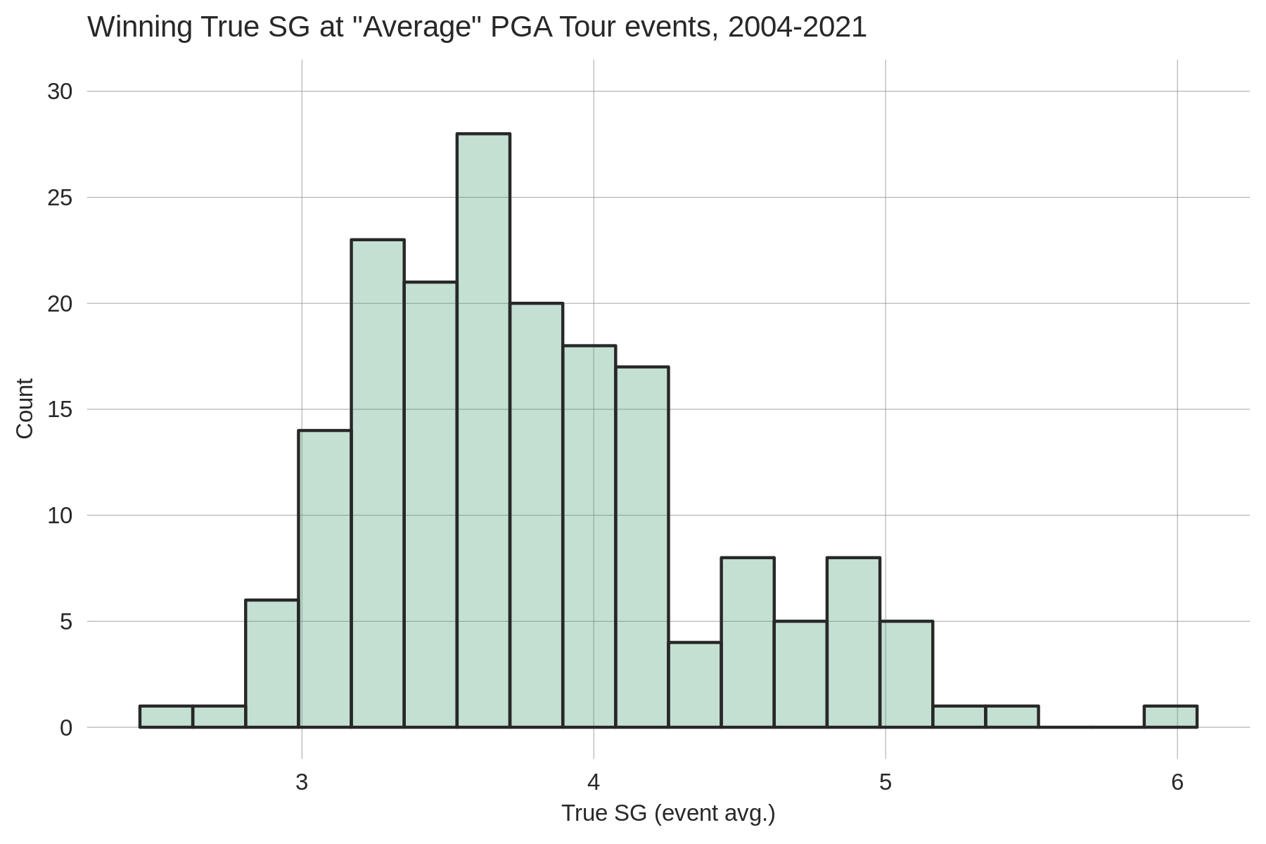
On our performance table, we display two versions of true expected wins: one uses the average PGA Tour event (as described above) as the reference event, while the other uses the average Major championship as the baseline event. We refer to these as xWins PGA and xWins Majors respectively. (Note that on the performance table only non-major performances count towards a golfer's xWins PGA, while only major championship performances count towards a golfer's xWins Majors. Of course, this is a somewhat arbitrary choice — any true SG performance has a corresponding xWins PGA or xWins Majors value.) To calculate these two variations of true expected wins we first must estimate the relationship between 4-round true SG averages and winning on the PGA Tour. (This relationship is allowed to vary over time as golf has become deeper in recent years, meaning that there is generally less separation between winners and the field today than in years past.) We estimate the SG-win relationship for our set of "average" PGA Tour events, and for major championships; both of these curves are shown below:
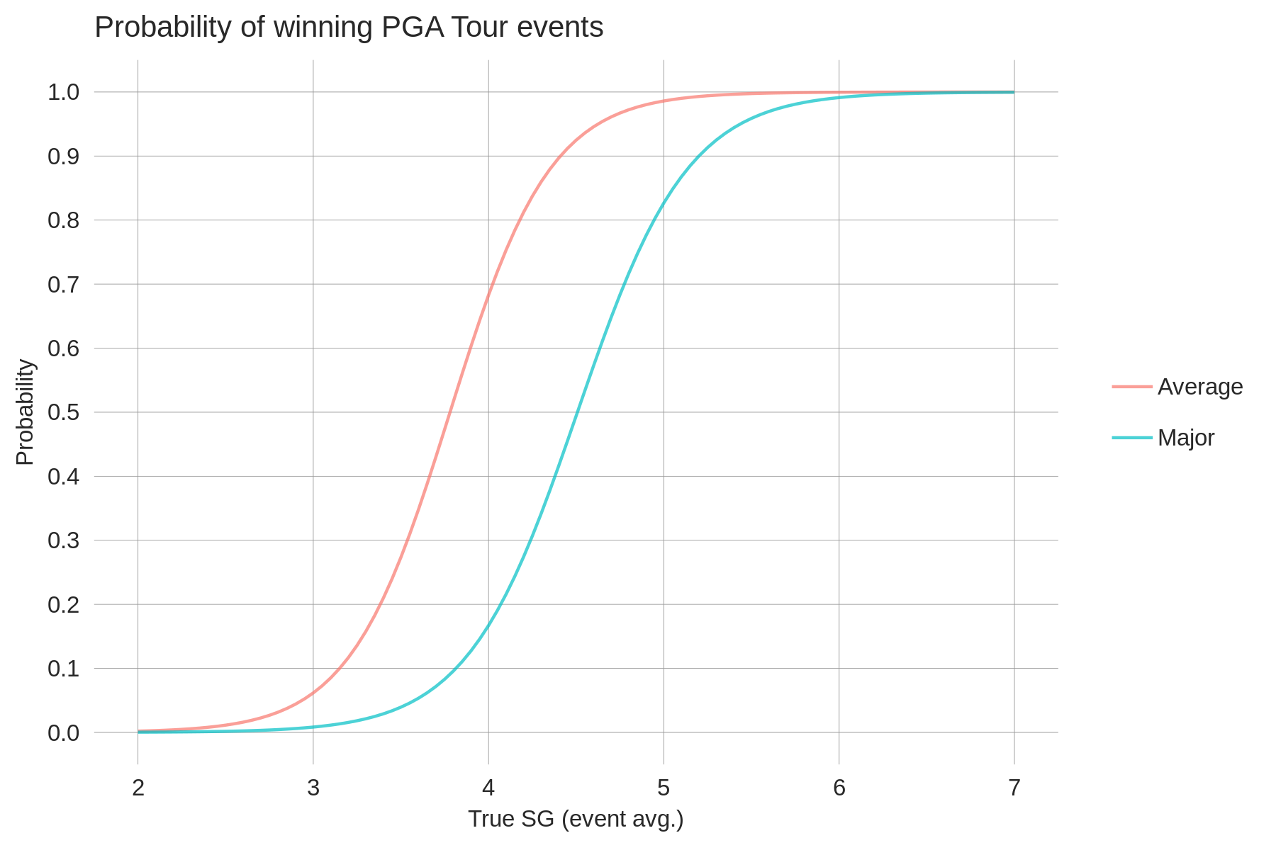
Using this graph it's simple to calculate expected wins given any true SG performance. For example, at the European Tour's 2021 Gran Canaria Lopesan Open, Garrick Higgo won with a performance of 2.8 true SG per round. Eyeballing the blue line above we can see that 2.8 true SG will only be good enough to win an average PGA Tour event ~3% of the time (i.e. that performance is worth 0.03 xWins PGA). As you would expect, a given true SG performance results in a lower probability of winning a major championship than it does a regular PGA Tour event. For reference, but mainly because it's mind-boggling, Phil Mickelson's true SG average in his 2nd place finish at the 2016 British Open was 6.6 strokes (weather-aided, however)! This predicts a win probability of 100% if the performance came at a regular PGA Tour event and 99.9% at a major. Alas, the record books show only a big fat zero.
Expected wins provide a means of quantifying the number of high-quality performances a golfer has had while avoiding the noise that is built in to using number of wins for this purpose. "Expected" statistics are used in many sports (e.g. expected goals in soccer), and they are all based on a similar premise. In golf, we were first introduced to the concept of expected wins from an article written by Jake Nichols of 15th Club.
Expected wins based on raw strokes-gained as a statistic carries with it the same drawbacks of raw strokes-gained: it can't be compared across tournaments of differing field strengths. Further, tournament characteristics like field size also confound raw SG-based expected wins comparisons (all else equal, the larger the field, the larger the raw SG typically required to win). For these reasons our website dispays what could be called "true" expected wins. In words, this measures the likelihood of a given 4-round performance winning some baseline event (e.g. an average full-field PGA Tour event). Like true strokes-gained, true expected wins from any tournament or tour can be compared.
To get a sense of the relationship between true strokes-gained and winning on the PGA Tour, shown below is a histogram of the 4-round true SG average of every winner from 2004-2021 at what I've dubbed "average" PGA Tour events (i.e. non-majors with field sizes between 130 and 156, and an average skill level between -0.2 and +0.2; 182 events fit this criteria):
On our performance table, we display two versions of true expected wins: one uses the average PGA Tour event (as described above) as the reference event, while the other uses the average Major championship as the baseline event. We refer to these as xWins PGA and xWins Majors respectively. (Note that on the performance table only non-major performances count towards a golfer's xWins PGA, while only major championship performances count towards a golfer's xWins Majors. Of course, this is a somewhat arbitrary choice — any true SG performance has a corresponding xWins PGA or xWins Majors value.) To calculate these two variations of true expected wins we first must estimate the relationship between 4-round true SG averages and winning on the PGA Tour. (This relationship is allowed to vary over time as golf has become deeper in recent years, meaning that there is generally less separation between winners and the field today than in years past.) We estimate the SG-win relationship for our set of "average" PGA Tour events, and for major championships; both of these curves are shown below:
Using this graph it's simple to calculate expected wins given any true SG performance. For example, at the European Tour's 2021 Gran Canaria Lopesan Open, Garrick Higgo won with a performance of 2.8 true SG per round. Eyeballing the blue line above we can see that 2.8 true SG will only be good enough to win an average PGA Tour event ~3% of the time (i.e. that performance is worth 0.03 xWins PGA). As you would expect, a given true SG performance results in a lower probability of winning a major championship than it does a regular PGA Tour event. For reference, but mainly because it's mind-boggling, Phil Mickelson's true SG average in his 2nd place finish at the 2016 British Open was 6.6 strokes (weather-aided, however)! This predicts a win probability of 100% if the performance came at a regular PGA Tour event and 99.9% at a major. Alas, the record books show only a big fat zero.
Expected wins provide a means of quantifying the number of high-quality performances a golfer has had while avoiding the noise that is built in to using number of wins for this purpose. "Expected" statistics are used in many sports (e.g. expected goals in soccer), and they are all based on a similar premise. In golf, we were first introduced to the concept of expected wins from an article written by Jake Nichols of 15th Club.
Betting Results
Why is your actual ROI less than your expected ROI?
The simple answer is that it is because our model is not perfect.
That is, the bookmaker's odds
contain information that is not reflected in our model's probabilities
that is useful for predicting performance. This is not suprising. The only way our
actual profit would match our expected profit (in the long-run) is if our model's estimates could
not be improved upon by incorporating the bookmaker's odds. One way to get around this
is to include the bookmaker's odds in your modelling process. This would make actual
profit line up with expected profit (under a few assumptions). We talk about related ideas in
an old betting blog. The fact
that our model's expected profit overestimates 'true' expected profit is why we use
a threshold rule to determine when to place a bet. For more details on the relationship between
our model's EV and actual returns, see the
final section
of this blog.
What are the criteria you use to select the bets shown on the betting results page?
All bets are placed through Bet365, so the first criteria is that the bet is offered there.
For each bet type (matchups, 3-balls, Top 20s, etc.) there is an expected value threshold that must be
met to place the bet. The specific value of these thresholds have tended
to evolve over time. The longer are the odds, the higher the threshold is.
Currently (updated Dec 1, 2021), at least a 5% edge (that is,
an expected value of 0.05 on a 1-unit bet) is required to take a matchup bet, 7% for a
3-ball bet, and somewhere in the range of 8-20% for Top 20s, Top 5s, and Outrights.
The purpose of imposing a threshold is to
ensure that you are in fact placing positive expected value bets; our model is not perfect, so
when the model says expected value is 5%, the 'true' value is probably closer to 0. We also do
not place 3-ball or matchup bets if we have very little data on any of the players involved
(cutoff is around 50 rounds). We do this because our predictions for low-data players have much more
uncertainty around them.
When are the bets displayed on the results page?
Bets are typically displayed on the page as soon as play begins on a given day (sometimes
a half-hour to an hour after play begins). For Scratch members
bets can be viewed as soon as we make them ourselves (typically well before play begins).
How do you decide how many units to wager?
We use a scaled-down version of the
Kelly Criterion. The Kelly staking strategy tells you how much of your bankroll to wager, and is an increasing function
of your percieved edge (i.e. how much greater your estimated win probability is than the implied odds) and a decreasing
function of the odds (i.e. longer odds translates to smaller bet sizes, all else equal). Importantly, the Kelly is designed
for sequential bets; i.e. your first bet is resolved before you placed your second, and so on. However, in golf betting we will
often have many simultaneously active bets. We don't have a fully worked solution to this, but sometimes we will lower the Kelly fraction
if there are already a lot of units in play. This is one reason you won't be able to find a consistent Kelly fraction when analyzing
our wagers; the second reason is that we vary the Kelly fraction by bet type and have also varied it over time as our (poorly-formed) betting
strategy has evolved.
Live Predictive Model
What does the live predictive model take into account?
How we arrive at our pre-tournament estimates of player skill and our
pre-tournament finish
probabilities is described
in detail here.
Once the tournament is underway, the largest updates to a golfer's finish probabilities
are due to their performance so far in the tournament (e.g. making bogey on the first 2 holes).
However, we also use the live scoring data
to update our pre-tournament predictions of golfer skill, and to update
our estimates of each hole's difficulty. Regarding the latter, we also predict how each hole will play
in the morning and afternoon (when there are
distinct waves) of each remaining round. As with our pre-tournament simulations,
the effects of pressure
are accounted for in the live model. This has an effect on a player's projected skill for
the 3rd and 4th rounds. Therefore, for the Matchup Tool, Props Tool, and Custom Simulation (which all use
the live model simulations), our probabilities
account for any changes to golfers' predicted skill due to their
performance so far in the tournament and their position on the leaderboard (i.e. pressure effects),
as well as the predicted difficulty of the course they will face (this will only matter if some of the golfers
are playing in different waves or on different courses for multi-course events).
For interested readers, here are a few more details. With respect to predicting hole difficulty, it is critical to correctly account for the uncertainty in difficulty. For example, on Thursday evening, not only is it important to be able to accurately estimate the expected difference in scoring conditions between Friday morning and afternoon, but also to accurately characterize the range of possible conditions. If the afternoon wave is expected to face a course that is 0.3 strokes harder than the morning wave, but there is a 10% chance that they face a course that is 1 stroke harder, that 10% will have important implications for everyone's cut probabilities. Back in the earlier days of the live model we didn't properly account for this uncertainty, and took a lot of grief for it when projecting the cutline. With respect to updating golfers' skill levels, we have fit models that inform us on how much to update a golfer's Round 2 skill level based on their pre-tournament data and their Round 1 performance (and analogous models for Rounds 3 and 4). When available, we incorporate the strokes-gained categories into these updates. All of this information is finally put to use in the simulations that ultimately generate the coveted finish probabilities. Each simulation starts by drawing random numbers to determine the course conditions, e.g. Thursday's morning wave faces a course that is 0.5 strokes easier than the afternoon; then, given these conditions, golfers' remaining scores in their current round are simulated (i.e. randomly drawn) according to their skill; before the next round, new course conditions are simulated, taking into account the (simulated) course conditions from the previous round(s), and golfers' skills are updated based on their (simulated) performance and any pressure effects are accounted for. This process repeats itself until the 4th round is simulated, at which point each golfer's finish position can be determined; perform many simulations like this and you end up with probabilities (e.g. a win probability is simply the fraction of simulations where the golfer of interest won). Hopefully this illustrates that our live model is internally consistent; every update that we will eventually make once the real data comes in (e.g. golfers' Round 1 performance affecting their skill for R2) is also made in each of the simulations.
For interested readers, here are a few more details. With respect to predicting hole difficulty, it is critical to correctly account for the uncertainty in difficulty. For example, on Thursday evening, not only is it important to be able to accurately estimate the expected difference in scoring conditions between Friday morning and afternoon, but also to accurately characterize the range of possible conditions. If the afternoon wave is expected to face a course that is 0.3 strokes harder than the morning wave, but there is a 10% chance that they face a course that is 1 stroke harder, that 10% will have important implications for everyone's cut probabilities. Back in the earlier days of the live model we didn't properly account for this uncertainty, and took a lot of grief for it when projecting the cutline. With respect to updating golfers' skill levels, we have fit models that inform us on how much to update a golfer's Round 2 skill level based on their pre-tournament data and their Round 1 performance (and analogous models for Rounds 3 and 4). When available, we incorporate the strokes-gained categories into these updates. All of this information is finally put to use in the simulations that ultimately generate the coveted finish probabilities. Each simulation starts by drawing random numbers to determine the course conditions, e.g. Thursday's morning wave faces a course that is 0.5 strokes easier than the afternoon; then, given these conditions, golfers' remaining scores in their current round are simulated (i.e. randomly drawn) according to their skill; before the next round, new course conditions are simulated, taking into account the (simulated) course conditions from the previous round(s), and golfers' skills are updated based on their (simulated) performance and any pressure effects are accounted for. This process repeats itself until the 4th round is simulated, at which point each golfer's finish position can be determined; perform many simulations like this and you end up with probabilities (e.g. a win probability is simply the fraction of simulations where the golfer of interest won). Hopefully this illustrates that our live model is internally consistent; every update that we will eventually make once the real data comes in (e.g. golfers' Round 1 performance affecting their skill for R2) is also made in each of the simulations.
Why do the Top 5 and Top 20 probabilities add up to more than they "should" (i.e. 500% and 2000%, respectively)?
This the case because the live model is simulated with ties allowed. As a consequence,
the default Top 5 and Top 20 probabilities provided are not suitable for making in-play bets where ties are resolved by
dead-heat rules. They will indicate more value than they should because they do not take into
account the reduced payouts received when there are golfers tied for the final paid finish
positions. Win probabilities in the live model will always add up
to 100%, as any ties for first are resolved in each simulation.
What does it mean for a Data Golf probability to 'account for dead-heat rules'?
First, if needed, read this
for a primer on what dead-heat rules are. Second, recall that an 'implied probability' from a bookmaker is the
probability required for the bet to have an expected value of zero. With a simple bet (where there are only 2 possible
outcomes — win or loss) this is equal to 1/european_odds. Once you have this implied probability, a simple
comparison with our predicted win probability is all that is required to assess the expected value of the bet.
In the case of bets where dead-heat rules apply, we construct an analogous probability that can be easily compared to
the bookmaker's implied probability (1/european_odds). By way of example and for simplicity,
suppose there is a top 5 bet where the only possible outcomes are for a golfer to finish
in the top 5 golfers (with no players tied for 5th),
to finish tied for 5th with 1 other golfer, and to finish outside the top 5 golfers.
The expected value for a 1 unit bet would be equal to:
P(finish_in_top5) * euro_odds + P(tie_for_5th) * euro_odds/2 - 1, which can be simplified to
(P(finish_in_top5) + P(tie_for_5th)/2) * euro_odds - 1. The first term in brackets here is what we are calling
a 'probability that accounts for dead-heat rules'. This is intuitive: in cases where the golfer's finish position
results in the application of dead-heat rules, we multiply the probability of that outcome occurring
by the dead-heat fraction that gets applied to the payout (e.g. 3 golfers tie for 1 paid position means we
multiply the probability by 1/3). These probabilities will add up to 500% for a top 5 bet and 2000% for a top 20
bet, and can be directly compared to the bookmaker's implied probabilities to assess their expected value.
What are the "match values" used in the WGC Match Play?
These match values are meant to capture how influential a given match is on the outcome of the tournament.
Consider a match between Golfers A and B. For every golfer in the field, we estimate two win probabilities:
their win probability if A wins the match, and their win probability if B wins. We then take the magnitude
of the difference between these win probabilities for each golfer, sum them up, and we have our match value.
In the first round of the Match Play tournament, the match values are mainly driven by their effects on the win probabilities of the golfers involved in the match. For example, in the 2021 edition of this event, Jon Rahm was the favourite at 6.5%. A win in his first round match against Sebastian Munoz would give him a win probability of 8.9% and a loss a win probability of just 1.9%, yielding a difference of +7%. The difference for Munoz between a Rahm win and a Rahm loss was -1.4%, while for the rest of the field the differences are all slightly negative. To arrive at our final match value of 0.14 (14%) we simply add up the absolute value of all these win probability differences.
In the second and third rounds of the group stage the match values can get more interesting. Here there can be large effects on the win probabilities of golfers not involved directly in the match of interest. These affected golfers will most likely be in the same group as those involved in the match, but there can also be scenarios where large effects are seen on golfers outside the group. For example, suppose in the third round Jon Rahm is playing a lower-ranked player and Rahm must win the match to advance. As the best player in the field, if Rahm is eliminated this substantially increases the win probability of the field compared to the scenario where he wins.
Hopefully these match values can provide some interesting insight as the tournament progresses.
Live Tournament Stats
What are the main sources of differences between Data Golf's strokes-gained numbers and the PGA Tour's?
We've tried to follow the PGA Tour's methods for calculating strokes-gained as closely as possible, but inevitably
there will be differences given we don't know exactly what their process is. Here are a few of the common sources of
disagreement: 1) labelling "recovery" shots. The expected strokes to hole out changes substantially if
a shot is deemed to be hit from a recovery
position (see p.15 of Mark Broadie's paper).
Labelling a shot as a recovery will have the effect of decreasing the previous shot's SG and increasing the SG of
the current shot. This is commonly the source of discrepancies in SG:OTT and SG:APP; 2) Labelling
shots as "Around-the-Green" versus "Approach-the-Green". Our method is simple: all shots within 50 yards from the pin are labelled
as ARG; the PGA Tour's method (I believe) is more complicated. This is commonly a source of discrepancies in SG:ARG and
SG:APP between DG and the PGA Tour; 3) We subtract the mean SG by category-hole, whereas the PGA Tour only subtracts the mean SG by category-round.
We perform this adjustment by hole because we are also providing hole-level SG estimates (read more on this in the next Q&A).
If a player doesn't hit a shot in every category on every hole, these two adjustment methods will yield different SG estimates.
SG:ARG is the category most commonly affected by this; 4) We make the adjustment mentioned in (3)
regardless of how many players have finished a hole (read more below), whereas the PGA Tour only
starts making their adjustment later in the round. This will contribute to discrepancies for all categories while a round
is ongoing. Overall the correlation between our SG figures and the PGA Tour's is high; for
a randomly selected round, SG:OTT, SG:APP, and SG:ARG values typically have a correlation of 0.96-0.98, while SG:PUTT is >0.99.
How is it possible for players to have non-zero SG values on holes where they didn't hit a shot in that category?
To arrive at the final SG category values displayed on the scorecard, we subtract the average baseline strokes-gained value in each category.
This adjustment occurs regardless of how many players have played the hole. For example, if only 2 players have played a hole and
they both made 20-foot putts, their strokes-gained putting is zero on that hole. Clearly this adjustment is not ideal for
assessing the quality of a player’s performance (i.e. we can be virtually certain by day’s end that
these 2 golfers will have positive SG:P on that hole). However, we view the purpose of our hole-level strokes-gained breakdown
as an accounting exercise, answering the question: where did the player gain/lose strokes relative to the other players
who have played this hole so far? This adjustment ensures the strokes-gained categories always add up to total strokes-gained.
One byproduct of this adjustment method is that players can have non-zero SG in a category on a hole even if they don’t hit a shot in that category. To see why this happens, consider a hole that is of average difficulty on approach shots but is harder than average around the green (i.e. the average ARG shot misses the green more often and / or ends up further from the pin than what we would expect at the typical PGA Tour course from the same lies). For a player that hits it to 20 feet on an approach shot from 200 yards — and therefore does not hit a shot in the ARG category on that hole — our SG accounting might look something like this: SG:APP = +0.25, SG:ARG = +0.03. Because the average baseline SG:ARG is negative on this hole, subtracting the category means results in a positive value for this player’s SG:ARG on that hole. Intuitively, this player gained strokes around the green by not having to play from a location (e.g. greenside rough) that plays harder than that location at a typical PGA Tour course.
An alternative method would be to tailor a baseline strokes-gained function to each hole. That is, to have hole-specific estimates of how many strokes it takes an average pro to hole out from each location. Done perfectly, this would result in players having an SG of zero in a category where they didn’t hit any shots. In our example above, the player would have all their SG allocated to the approach category. This comes from the fact that the expected strokes to hole out from 200 yards would be higher (because missing the green comes with a bigger penalty), and so a shot hit to 20 feet might gain 0.28 strokes on that hole compared to the usual 0.25. Compared to the previous accounting, we’ve moved the 0.03 strokes the player gained around the green to approach.
It’s possible to construct extreme examples that highlight "flaws" with this second method: consider a hole where everyone who misses the green chips it to an inch due to a funnel pin; hitting an approach shot from 200 yards to 25 feet on the green would gain approximately 0 strokes using a baseline function specific to this hole. This is a drawback in the sense we get very little information regarding the true quality of the players' approach shots on this hole. Using the first method to adjust SG would yield something like SG:APP = +0.25, SG:ARG = -0.25 — also not ideal, but at least we retain useful information on the approach shot. In any case, the more important consideration here is that the second method is very hard to implement, especially live during the tournament. It's mainly for that reason that we stick to the simple adjustment of subtracting off the mean SG by category and hole.
Fantasy Projections
How do I interpret a golfer's fantasy points projection?
A golfer's projection is the expected number of points we are predicting they will earn.
We form these projections by using the output from
our predictive model to simulate
each golfer's performance at the hole level. A hole-level simulation is necessary to simulate
fantasy
scoring points, which depend on hole-specific scores as well as a golfer's performance
on consecutive holes. By performing many simulations we can obtain a distribution for each golfer's
earned fantasy points; the projection is then simply the average point value across all
simulations.
How does the weighting method of long-term form and short-term form work?
As said above, our fantasy projections are generated using the predicted skill levels from our predictive
model. Dedicated followers will know that these predicted skill levels are formed using a continuously decaying
weighting scheme, as opposed to a discrete long-term/short-term form weighting.
Therefore, it is not actually the case that our
default fantasy projections are a weighted average of long-term form and short-term form.
When you move the long-term weight,
we compare the golfer's long-term (last 2 years) form to their short-term (last 3 months) form, and adjust the
projection accordingly depending on whether it is higher or lower, and whether you've increased
or decreased the weight. The same applies for short-term form.
The weighting adjustment has to be done this way to accomodate the fact that we want
our optimal projection to use a continous weighting scheme, while also giving users the ability to make their own simple
adjustments to long-term form versus short-term form.
A couple final points:
a weighting scheme of 7/3 is the same as 70/30; we simply add up the weights you input and normalize them to sum to 1.
If a golfer does not have any short-term data, they are assigned the field average projection. The one
exception to this is rookies, who are given the average historical point values for rookies.
What role do course conditions play in the fantasy projections?
Easier course conditions increase the projected scoring points for all golfers,
but the increase is largest for the top players. Conversely, harder course conditions decrease
expected scoring points for all players, with the decrease being larger for the better golfers.
Therefore, the relevant effect from toggling the course difficulty parameter is that easier
conditions spreads the projections further apart, while harder conditions brings them closer together.
If course conditions simply shifted everyone up or down by the same amount, this would be irrelevant with regards to
forming optimal lineups.
To understand why this happens, let’s focus on the example where course conditions are made to be easier (i.e. a lower expected scoring average). There are two reasons why this causes projections to spread apart. First, easier course conditions means there are more points scored per round (on average), which makes playing the additional weekend rounds more valuable. Because better golfers make the cut more often, they benefit more from the easier scoring conditions. The second reason for the widening of projections when conditions are made easier is the non-linear scoring point breakdown in fantasy golf. That is, the point difference between birdies and pars is greater than the point difference between pars and bogeys (in all three formats — DK, FD, Yahoo — we offer). Additionally, there are points for birdie streaks and bogey-free rounds. This means that on courses where the difference between good scores and bad scores is 3-4 extra birdies, as opposed to courses where the difference is 3-4 fewer bogies, the point separation between the top players and the field will be greater. As a result, even at no-cut events, easier course conditions will spread projections apart (albeit to a smaller degree than at cut events). This second reason is, of course, the only relevant one when considering course conditions for Showdown or Weekend slates.
To understand why this happens, let’s focus on the example where course conditions are made to be easier (i.e. a lower expected scoring average). There are two reasons why this causes projections to spread apart. First, easier course conditions means there are more points scored per round (on average), which makes playing the additional weekend rounds more valuable. Because better golfers make the cut more often, they benefit more from the easier scoring conditions. The second reason for the widening of projections when conditions are made easier is the non-linear scoring point breakdown in fantasy golf. That is, the point difference between birdies and pars is greater than the point difference between pars and bogeys (in all three formats — DK, FD, Yahoo — we offer). Additionally, there are points for birdie streaks and bogey-free rounds. This means that on courses where the difference between good scores and bad scores is 3-4 extra birdies, as opposed to courses where the difference is 3-4 fewer bogies, the point separation between the top players and the field will be greater. As a result, even at no-cut events, easier course conditions will spread projections apart (albeit to a smaller degree than at cut events). This second reason is, of course, the only relevant one when considering course conditions for Showdown or Weekend slates.
What is the role of ownership and exposure in fantasy golf?
Broadly speaking, you want to maximize expected points (i.e. the projection) of
your lineups while minimizing the overlap your lineups have with the other players
in your fantasy contest/tournament. The reason is that the more players who
own the winning lineup, the smaller the
payout will be for owning that lineup. However, in all but the largest tournaments, it's
unlikely that your lineup will be exactly duplicated. Even so, it is better
to play low-owned golfers conditional on having same projection in the bigger
tournaments (why this is true is actually not obvious; we discuss this more below).
Therefore, if two golfers have similar projections, but one has a lower projected
ownership, then it is better to play the lower-owned golfer.
A more difficult question is how much a slightly lower ownership
is worth in terms of projected points. That is, if golfer A is projected to score
5 fewer points than golfer B, how much lower does golfer A's ownership need to be
than golfer B's for it to be profitable (in expectation) to play him?
This is a hard question whose answer depends on the size of the
contest under consideration. In general, it is the case that
ownership matters less the smaller is the number of contestants involved.
In the limit case
of a head-to-head matchup, ownership (i.e. who your opponent is playing) is
irrelevant to your strategy; you should always play the golfers with the
highest projections. This is
shown below with a simplified example.
Ignoring ownership considerations, the exposure profile you take will just be a matter of risk preference. If you were risk-neutral, meaning that all you care about is expected value (as opposed to also disliking variance), then exposure is not relevant. A risk-neutral player should just play the highest projected lineups (again, ignoring ownership considerations). However, most of us are risk-averse, in which case you may not want to have your entire week of fantasy golf riding on the performance of 1 or 2 golfers — especially if the golfer is coming off 3 straight missed cuts (a common DG recommendation). Thus, if you aren't a glutton for punishment, it is a good idea to reduce the variance in weekly returns by limiting exposure to any single golfer. Of course, by limiting variance you are trading off positive expected value (if our projections are somewhat accurate). How much of this tradeoff you are willing to make comes down to personal preference. Finally, the difference between one golfer making 100% of the top 20 lineups and another one missing them entirely is often only a couple projected points; given that our projections certainly aren't perfect, this is another reason to diversify to some degree.
Ignoring ownership considerations, the exposure profile you take will just be a matter of risk preference. If you were risk-neutral, meaning that all you care about is expected value (as opposed to also disliking variance), then exposure is not relevant. A risk-neutral player should just play the highest projected lineups (again, ignoring ownership considerations). However, most of us are risk-averse, in which case you may not want to have your entire week of fantasy golf riding on the performance of 1 or 2 golfers — especially if the golfer is coming off 3 straight missed cuts (a common DG recommendation). Thus, if you aren't a glutton for punishment, it is a good idea to reduce the variance in weekly returns by limiting exposure to any single golfer. Of course, by limiting variance you are trading off positive expected value (if our projections are somewhat accurate). How much of this tradeoff you are willing to make comes down to personal preference. Finally, the difference between one golfer making 100% of the top 20 lineups and another one missing them entirely is often only a couple projected points; given that our projections certainly aren't perfect, this is another reason to diversify to some degree.
How does the "diversity" slider work and why should I use it?
When set to zero, the optimal lineups are returned based on the actual
projections. By moving the slider to the right, projections are given
a series of random shocks. That is, a first shock will be applied to each
player's projection (e.g. increasing golfer A's projection by 2 points) and the
best lineup will be found and returned based on these shocked
projections; then, a new shock will be given and a second lineup based
on these new projections will be returned; this process repeats itself until
the correct number of lineups have been returned. The further the slider is to the right,
the larger is the size of the shocks applied. In this process,
the highest projected players are more likely to get
negative shocks, while the opposite is true for the lowest projected players.
The effect of adding these shocks is that a more diverse set of players will make it into the returned optimal lineups. That is, the set of player exposures will become more uniform the larger are the shocks. Limiting exposure by using the diversity slider will tend to have a different effect than limiting it directly (with the maximum exposure setting). For example, if you request 20 lineups with a maximum exposure of 50%, it's likely that the first 10 lineups will have the same 2 golfers in all of them. By using the diversity slider, you may be able to achieve 50% exposure to both of these golfers while having less overlap between the lineups that include them.
The effect of adding these shocks is that a more diverse set of players will make it into the returned optimal lineups. That is, the set of player exposures will become more uniform the larger are the shocks. Limiting exposure by using the diversity slider will tend to have a different effect than limiting it directly (with the maximum exposure setting). For example, if you request 20 lineups with a maximum exposure of 50%, it's likely that the first 10 lineups will have the same 2 golfers in all of them. By using the diversity slider, you may be able to achieve 50% exposure to both of these golfers while having less overlap between the lineups that include them.
I don't believe you that ownership matters less in smaller contests. Can you prove it?
(Nobody actually asked this question)
Suppose that each entrant in the contest chooses just 1 golfer, and
that the prize pool is winner-take-all. Ownership here will be taken to be the percentage of players
other than you that are playing a given golfer. Given this setup, the expected value to
playing a golfer with a win probability of
w and an ownership of x percent, in a contest of size N, is equal to:
How much does ownership matter in this simplified setup? With just 2 players (i.e. a head-to-head matchup), you should always play the golfer with the highest win probability. If your opponent is playing the highest-win-probability golfer, then you should also play this golfer thus ensuring a profit of 0; playing any other golfer will yield a negative expected profit (because w will be less than 0.5). If your opponent is not playing the best golfer, profit is clearly maximized by you playing the best golfer. Therefore, irrespective of your opponent's decision, you should play the highest-win-probability golfer, which means that ownership is not relevant to the decision in a head-to-head matchup. At the other extreme, if N is very large, expected value is equal to 0 if a golfer's win probability is equal to their ownership in the contest (\( w=x \)). In these contests, ownership will be important: whenever a golfer's ownership is below their win probability, it will be positive expected value to play that golfer.
To further build intuition, consider the case of a 3-player contest, and suppose there are just 2 golfers to choose from: golfer A who has a 67% win probability, and golfer B who has a 33% win probability. If the other 2 entrants are both playing golfer A, then (using the above formula), the expected profit will be 0 from playing either golfer. That is, even though the ownership of golfer B was 0%, a win probability of greater than 33% is required to make it profitable to play golfer B. If one of the other 2 entrants is playing golfer A, while the other has golfer B, then you should play golfer A. And finally, if both other entrants are playing golfer B, then clearly you should play golfer A. So we see that in this case ownership does matter, but a golfer's win probability is probably still the most important consideration in your decision. In general, as N increases, ownership becomes more important to the optimal decision.
To really flush out this point, below I examine a specific scenario. Consider a contest of size N, and suppose you are deciding between playing a golfer with a 30% win probability and whose ownership is 30%, and a golfer with a 25% win probability whose ownership is unknown. In the plots below, the horizontal dotted line in each plot indicates the expected value from playing the golfer who has a win probability of 30% and an ownership of 30%. For small contests, it is negative expected value to play this golfer (because, by playing the golfer, you have a substantial impact on the payout); as N grows, expected value converges to 0 because the impact of your decision to play the golfer on the payout becomes negligible. The bolded black curve in each plot indicates the expected value from playing a golfer who has a 25% win probability at various ownership levels (as indicated on the x-axis). We see that in a contest with 10 players, even at 15% ownership it is still more profitable to play the 30% owned / 30% win probability golfer. As N increases, we see that the level of ownership that makes playing the 25% win probability golfer equally profitable (i.e. where the bold line intersects the dotted horizontal line) converges to 25%, as expected. For example, the second plot shows that in a 50-player contest, an ownership of 24.6% or lower will make the 25% win probability golfer the more profitable play.
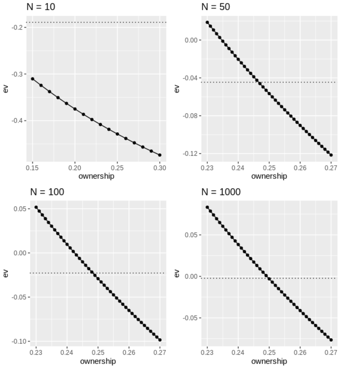 The final plot below shows the full relationship between break-even ownership and contest size. The specific
relationship will depend on the parameter values (i.e. the golfers' win probabilities and ownerships), but
the overall pattern will be similar.
The final plot below shows the full relationship between break-even ownership and contest size. The specific
relationship will depend on the parameter values (i.e. the golfers' win probabilities and ownerships), but
the overall pattern will be similar.
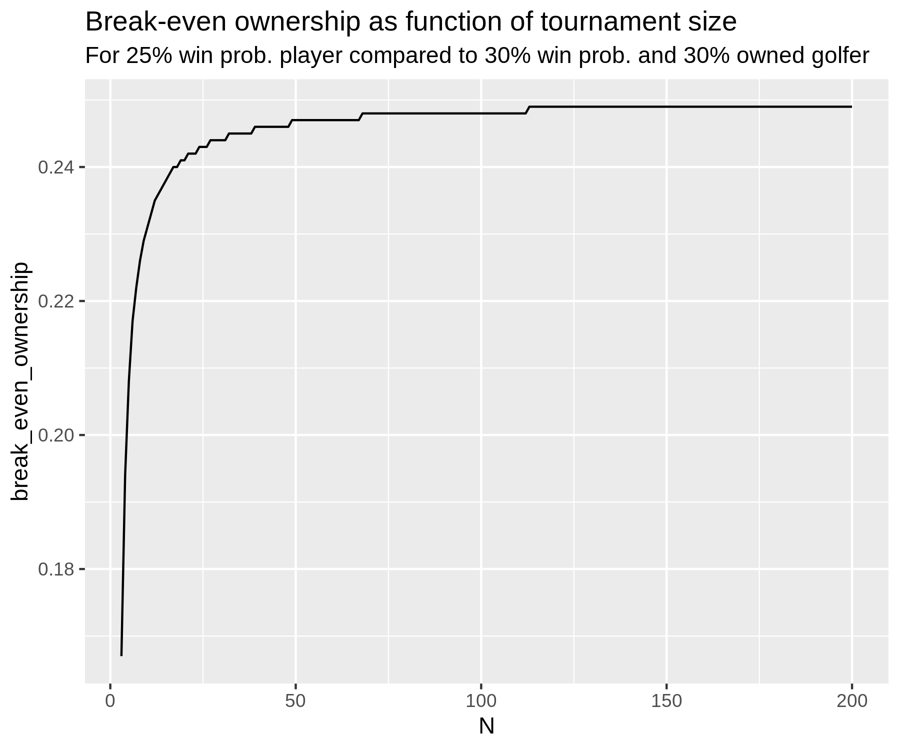 For the smallest
contest sizes, it is evidently not possible to even have 25% or 30% ownership; in any case,
the curve captures the idea that in the smallest contests there is no level of ownership that will warrant
playing the lower-win-probability golfer. Another implicit assumption here is that your decision
does not affect the win probabilities; this will be true as long as every golfer
is being played by at least 1 person in the contest. (For example, if nobody is playing the 25% win
probability golfer, and you also decide to not play him, this will increase the win probability of
all other golfers in that contest.) Of course, this analysis is only possible because we've assumed an incredibly
simple format; once we allow for 6-player lineups and complex payout structures... things get difficult.
More on those complexities later.
For the smallest
contest sizes, it is evidently not possible to even have 25% or 30% ownership; in any case,
the curve captures the idea that in the smallest contests there is no level of ownership that will warrant
playing the lower-win-probability golfer. Another implicit assumption here is that your decision
does not affect the win probabilities; this will be true as long as every golfer
is being played by at least 1 person in the contest. (For example, if nobody is playing the 25% win
probability golfer, and you also decide to not play him, this will increase the win probability of
all other golfers in that contest.) Of course, this analysis is only possible because we've assumed an incredibly
simple format; once we allow for 6-player lineups and complex payout structures... things get difficult.
More on those complexities later.
$$ \normalsize \>\>\>\>\>\>\>\> w \cdot \frac{1}{x \cdot (\frac{N-1}{N}) + \frac{1}{N}} - 1 $$
where I've assumed the buy-in is 1 unit and there is no "take" (or vig/juice/rake).
The denominator is the fraction of players that played the golfer (\( \frac{1}{N} \) is
your contribution to this fraction). Using the formula, if you
play a golfer that nobody else is playing, then the payout if you win is
equal to N units (and so profit is N-1).
How much does ownership matter in this simplified setup? With just 2 players (i.e. a head-to-head matchup), you should always play the golfer with the highest win probability. If your opponent is playing the highest-win-probability golfer, then you should also play this golfer thus ensuring a profit of 0; playing any other golfer will yield a negative expected profit (because w will be less than 0.5). If your opponent is not playing the best golfer, profit is clearly maximized by you playing the best golfer. Therefore, irrespective of your opponent's decision, you should play the highest-win-probability golfer, which means that ownership is not relevant to the decision in a head-to-head matchup. At the other extreme, if N is very large, expected value is equal to 0 if a golfer's win probability is equal to their ownership in the contest (\( w=x \)). In these contests, ownership will be important: whenever a golfer's ownership is below their win probability, it will be positive expected value to play that golfer.
To further build intuition, consider the case of a 3-player contest, and suppose there are just 2 golfers to choose from: golfer A who has a 67% win probability, and golfer B who has a 33% win probability. If the other 2 entrants are both playing golfer A, then (using the above formula), the expected profit will be 0 from playing either golfer. That is, even though the ownership of golfer B was 0%, a win probability of greater than 33% is required to make it profitable to play golfer B. If one of the other 2 entrants is playing golfer A, while the other has golfer B, then you should play golfer A. And finally, if both other entrants are playing golfer B, then clearly you should play golfer A. So we see that in this case ownership does matter, but a golfer's win probability is probably still the most important consideration in your decision. In general, as N increases, ownership becomes more important to the optimal decision.
To really flush out this point, below I examine a specific scenario. Consider a contest of size N, and suppose you are deciding between playing a golfer with a 30% win probability and whose ownership is 30%, and a golfer with a 25% win probability whose ownership is unknown. In the plots below, the horizontal dotted line in each plot indicates the expected value from playing the golfer who has a win probability of 30% and an ownership of 30%. For small contests, it is negative expected value to play this golfer (because, by playing the golfer, you have a substantial impact on the payout); as N grows, expected value converges to 0 because the impact of your decision to play the golfer on the payout becomes negligible. The bolded black curve in each plot indicates the expected value from playing a golfer who has a 25% win probability at various ownership levels (as indicated on the x-axis). We see that in a contest with 10 players, even at 15% ownership it is still more profitable to play the 30% owned / 30% win probability golfer. As N increases, we see that the level of ownership that makes playing the 25% win probability golfer equally profitable (i.e. where the bold line intersects the dotted horizontal line) converges to 25%, as expected. For example, the second plot shows that in a 50-player contest, an ownership of 24.6% or lower will make the 25% win probability golfer the more profitable play.
Course Fit
Intuitively, how do I interpret the radar plot on the course
fit page?
This visualization indicates which types of golfers are expected to over-perform or under-perform
their baseline at each course on the PGA Tour. If a data point is further from the center of the plot
than the average course, golfers who possess above-average values for that attribute should
be expected to perform above their baselines at that course. It is important to take into account
all 5 attributes when drawing conclusions about a golfer; for example, if both driving distance and driving
accuracy have
above-average predictive
power at a course, then a golfer who is
long but inaccurate will have adjustments to their baseline that go in opposite directions, meaning the net adjustment
could be positive or negative. If you flip through the plots (in the default view), you will notice that
the course-specific values for putting and around-the-green do not vary much, while the driving distance and
driving accuracy values do. This indicates that PGA Tour courses differ meaningfully in the degree to which
they favour golfers with length (or accuracy) off the tee, while they don't appear to differ much in how much they favour
good putters or around-the-green players (at least not in a way that can be easily measured in the data).
Another unusual thing you may notice is that certain courses
have below (or above)-average predictive power in most attributes;
Waialae CC is an example
of a course where nothing seems to predict performance particularly well. This means that overall performance at Waialae is
more unpredictable than the average PGA Tour course. As a result, we should downgrade our expectations for players
who have above-average values in each attribute, meaning that Waialae is a course where worse players are expected
to perform above their baselines and better players below them. Intuitively, randomness as a property
of a course can be thought of as providing good course fit for below-average golfers (e.g. would you rather
try to beat Rory McIlroy at a PGA Tour course or at the mini putt from Happy Gilmore with the laughing clown?).
A final note on interpretation: if you toggle to the 'relative importance' view, the
data for each attribute is scaled to take on values between 0 and 1. This makes it easier to see
differences between courses in the less predictive attributes (SG:Putting and SG:Around-the-green).
However, in this view it is no longer possible to make direct comparisions of predictive power
across attributes.
Statistically, how do I interpret the radar plot on the course
fit page?
As stated in the plot information on the page, the default view
for the radar plot shows the predictive power
of each golfer attribute (driving distance, driving accuracy, etc.) on total strokes-gained at each course.
The value of each attribute at the time of a tournament is equal to a weighted average of historical performances.
For example, the 'driving distance attribute' is a weighted average of past driving distance performances;
it is the predictive power of this weighted average on performance that we are estimating.
More detail on how these averages are formed can be
found here.
Predictive power is a function of both effect size — for a 1 unit increase in some skill, how much does
performance improve on average — and variance — how large are differences in the
skill under consideration across golfers? To make things more readily interpretable, we normalize each attribute to
have a mean of 0 and a standard deviation of 1. Then, by running regressions of total strokes-gained
on the set of attributes, the coefficients provide us with an estimate of each attribute's relative predictive power
(because the variance has been made equal across attributes). It is these coefficient estimates that are displayed
in the visualization; in practice, we estimate all of the course-specific estimates
at once, using a random effects model.
Note that
the predictive power of each attribute is estimated while holding constant the values of the other
attributes (that is what a regression does, intuitively). Often you see analyses where
raw correlations are shown between, for example, a golfer's historical strokes-gained approach
and their subsequent performance. This raw correlation picks up the fact that good approach players
are also good drivers of the ball, on average. We do not want to pick up this spurious part of the
correlation, which is why all 5 attributes are included in the same regression.
Finally, the numbers that actually go on to the plot are scaled to takes values
between 0 and 1 and therefore
by themselves do not have any meaning; they are only meaningful in relation to
values from other courses and other attributes. For more related reading on this, see the updated
model methodology blog.
How do the course fit
plots relate to the variance decompositions shown on the
historical event data
page?
The variance
decompositions
from the historical event data page indicate how much each strokes-gained
category contributed to the total variation in scores (i.e. total strokes-gained) in a given week.
It is a descriptive exercise.
Conversely, as described above, the radar plots on the course fit page indicate which
golfer attributes (e.g. strokes-gained approach) predict performance at each course.
It is a predictive exercise.
Most of the time the variance decomposition will fit intuitively with the shape of the
radar plot: for example, at Colonial CC a golfer's driving distance is significantly less predictive
than at the average course. As intuition would suggest, we also see on the historical event
data page for Colonial that strokes-gained
off the tee accounts for less variation in scores than at the average course. Generally, when
a given strokes-gained category accounts for a smaller (larger) share of
the variation in scores at some course than it does at the average course, we should expect this
strokes-gained category to be less (more) predictive of
performance at that course relative to its predictive power at the average course.
But this does not always have to be the case. For example,
driving distance is more predictive of performance at the South Course at Torrey Pines than the average course; typically we would
expect this to result in SG:OTT accounting for a larger share of the variance in scores at Torrey Pines. In fact,
we see the opposite. Several stories could explain this: perhaps longer players have more of an
advantage on approach shots at Torrey Pines, or perhaps there is just a tighter relationship between
distance and SG:OTT at Torrey Pines than at other courses. Ultimately, if the goal is to predict
performance, the precise explanation does not really matter (..an economist rolls over in their
grave..). As said above, the variance decompositions are mostly
just an interesting descriptive exercise; on the other hand, the information from the course fit plots is entering directly into
our predictive model.
If you find an especially puzzling pair of variance decomposition-radar plots, let us know!
Course Table
What is the interpretation of the "SG Difficulty" statistics? How are they calculated?
The SG Difficulty statistics should be interpreted as the number of strokes easier (positive values) or harder (negative values) a specific shot type plays at each course
relative to that shot type on the average PGA Tour course. For example, at the 2021 Masters, putts over 15 feet played on average 0.06 strokes harder than
putts over 15 feet at a typical PGA Tour course.
Now, some details. First, recall that to calculate strokes-gained a baseline function that provides the expected strokes to hole out from every distance and lie (fairway, rough, etc.) is required. By using the expected strokes to hole out for the starting and ending point of each golf shot, strokes-gained is easily defined and calculated. (See here for some examples.) We'll call this baseline strokes-gained because it is an unadjusted number calculated directly from the baseline function. The SG Difficulty statistics are equal to the average baseline strokes-gained for the relevant shot type. (We do make strength-of-field adjustments as well so that these values can be interpreted as the expected baseline strokes-gained for an average PGA Tour field.)
The baseline function is estimated using data from all PGA Tour courses. Therefore, using data from all PGA Tour courses, the average baseline strokes-gained value will be zero for off-the-tee shots, for approach shots, and for any group of shots with a large enough sample size. However, specific courses may play easier or harder than what is predicted by this baseline function. For example, the average baseline strokes-gained value for off-the-tee shots at the Plantation Course at Kapalua was +0.1 at the 2021 Sentry Tournament of Champions. This is because Kapalua has easy-to-hit fairways and several holes where 400-plus yard drives are not uncommon. The fact that the average strokes-gained value for tee shots is positive means that players hit their tee shots to "better" (i.e. closer to the pin, and in easier, e.g. fairway vs. rough, lies) locations at Kapalua than at the typical PGA Tour course. Harbour Town is an example of a course that has a negative average baseline strokes-gained off-the-tee value, as it has one of the lower driving distance averages of PGA Tour courses. (As an aside, note that the official strokes-gained numbers by category on the PGA Tour website subtract off the mean baseline strokes-gained in each category by round, meaning they will have always have a mean of zero.)
There is some nuance to interpreting these numbers, however. For example, Augusta National had the 6th lowest baseline strokes-gained on approach shots in 2021; as described above, this means that approach shots at Augusta were hit to worse locations (again, "location" as defined only by distance and lie) than approach shots at the typical PGA Tour course. However, Augusta National was also rated as the hardest around-the-green course on the PGA Tour in 2021. It is thus tempting to think that Augusta's approach shots are actually much "harder" than we've given them credit for: not only are players at Augusta hitting their approach shots to worse lies and longer distances from the pin than the average course, these around-the-green shots also play much harder than their distance / lie predicts! However, I think the most informative way to display this data is as we've done it; average baseline strokes-gained by category tells us exactly why it's so difficult to hole out from 150 yards at Augusta National: the approach shots end up slightly further from the pin than the average PGA Tour course, and the shots that miss the green result in the hardest around-the-green shots on tour.
Approach Skill Page
What data is included?
For the fairway bins, all shots between 50 and 250 yards are included. For non-fairway bins (which we just label as "rough"),
all shots between 50 and 225 yards are included. The purpose of the upper bounds here is to focus on shots that are actually approach shots,
and not layups or shots that players are just hitting as far as possible. Any shot labelled as a recovery shot is also excluded.
Data from any PGA Tour event or Major that has strokes-gained category data shown on the player profile pages is included.
Data from any PGA Tour event or Major that has strokes-gained category data shown on the player profile pages is included.
How do I interpret the 5 stats?
Strokes-gained per shot has the usual interpretation of number of strokes better than what we would
expect from an average PGA Tour player. As with our round-level true strokes-gained, these numbers
are adjusted to account for field strength. Adjusted proximity (which we just list as 'proximity' on the page)
takes raw proximity and adjusts it for the difficulty of each shot. This yields values like -3 feet, which indicates
that the shot was hit 3 feet closer to the pin than what we would expect from an average PGA Tour player hitting from the same location.
On the page, we list the adjusted proximity numbers relative to the average proximity in that bin. For example,
in the 100-150 (Fairway) bin, the base proximity we use is 22.3 feet—meaning an adjusted proximity of -3 would be displayed
as 19.3 feet. (This is for purely aesthetic reasons, and obviously doesn't change the meaning of the statistic in any way.)
There are more details on the proximity adjustment in this footnote.
Adjusted GIR (listed as "GIR" on the page) works in much the same way as adjusted proximity. If we estimate that an average player
would hit the green from some location 85% of the time, then a hit green gets a value of +15% while a missed green gets a value of -85%.
As with proximity, we display the adjusted GIR values relative to the average GIR % in each bin.
More details here. Finally, good shot % is the fraction
of shots a player hits that gain at least 0.5 strokes, and poor shot avoidance is 1 minus the fraction of shots a player hits that lose at least 0.5 strokes.
How is a player's percentile rank in each statistic calculated?
If a player is ranked in the 95th percentile in a stat, this means they are better than 95% of PGA Tour golfers in
that stat. To calculate percentiles, we only include players who have hit a certain number of shots in the distance
bin under consideration. For example, for the 100-150 (Fairway) bin over the last 12 months, the shot cutoff is 103 shots.
We choose cutoffs such that there are roughly the same number of players in included in each bin, which means the cutoffs will be lower
in bins where fewer shots are hit, such as 50-100 (Fairway). Once we have the group of players to be included in each bin, we calculate
a player's percentile as \( 1 - \frac{rank}{N} \), where rank is the player's rank and N is the total number of players.
This results in percentiles that range from 0th to 99th
(a 100th percentile is not possible in this formulation). For the low-data players that are included on the page, their value
does not contribute to the percentile calculation, but they are given a percentile position by calculating the fraction of high-data players
at or below their value in the statistic.
Why is the 50th percentile not equal to zero for strokes-gained per shot in each approach bin?
As described in the Q&A above this, only players with sufficient data are included in the percentile calculation.
If these higher-data players on average gain strokes over the excluded lower-data players (which is typically the case),
then the average SG of included players will be positive.
DG Points
What are DG Points?
DG Points are our best attempt at grading performances according to finish position and tournament quality.
Points are assigned based on how "difficult" it is to achieve a given result. For example, we estimate that a Top 5 Player—which we define as a player with a skill level of +2—would beat the field at the 2024 Players 4.9% of the time, they would finish in the top 10 30% of the time, and in the top 50 71% of the time. The lower the Top 5 Player (T5P) probability, the more points a player receives for that finish. (If you are familiar with our measures of field strength, this is a similar idea to the X-score.)
The formula for DG points is 1/probability — 1, where "probability" is the T5P probability described above. Continuing with the same example, winning the 2024 Players received 19.5 points, 10th place received 2.3 points, and 50th place received 0.4 points.
Points are assigned to at most the top 50 finishers in a tournament. Players that miss the cut or withdraw do not receive points. All professional events shown on our player profiles receive points with the exception of qualifying schools and the LIV team finals. There are a few tournaments that have customized point distributions:
1) Majors: all majors receive points based on a T5P win probability of 3.45% (28 points). Points for non-winning finish positions decline more sharply at the Masters due to its smaller field.
2) Tour Championship: points are awarded using the non-starting stroke 72-hole scores.
3) WGC Match Play: only the top 16 players receive points (regardless of format).
4) Zurich Classic: up to 50 teams (100 players) can receive points (but fewer than 50 will receive points due to the cut). Finish probabilities were simulated as a regular stroke play tournament using the average skill by team.
The following table shows the average DG points awarded to various finish positions for a few different types of events in 2024:
Tour
DG Points distributed to...
Event Type
1st
5th
10th
25th
50th
Major Championships
PGA Championship, U.S. Open, Open Championship
28.0
6.26
3.2
1.23
0.55
Masters Tournament
28.0
5.57
2.67
0.85
0.24
Olympics
Paris 2024
12.85
2.49
1.13
0.27
0.02
PGA Tour
The Players Championship
19.46
4.46
2.35
0.93
0.4
Signature Events
16.85
3.62
1.78
0.54
0.1
Regular Season Events
10.44
2.67
1.46
0.6
0.27
Opposite Field Events
4.53
1.31
0.75
0.3
0.14
DP World Tour
Rolex Series Events
7.28
1.77
0.93
0.35
0.14
Non-Rolex Series Events
3.5
0.95
0.52
0.2
0.09
LIV Golf
Average Event
6.21
1.36
0.62
0.14
0.0
Korn Ferry Tour
Average Event
2.66
0.82
0.47
0.2
0.1
Why should I care about DG Points over strokes-gained?
Adjusted strokes-gained forms the backbone of our model and is very useful both for predicting future performance and evaluating
past performances. However, point systems tend to have a couple advantages over SG when it comes to evaluating performances and
careers: 1) they put more weight on winning and high finishes, and set a floor for bad play (0 points), and 2) they operate at the event-level,
whereas SG operates at the round-level. (See section 2 of this newsletter
for more thoughts on this.)
Consider Phil Mickelson's career. The two best adjusted SG performance of Phil's career came at the 2016 Open Championship (+6.6; finished 2nd) and the 2006 BellSouth Classic (+6.4; won), but most people wouldn’t place either of those performances among his top achievements. Point systems only take into account finish position and the quality of the field, which fits more with our intuition about how to evaluate golfers' careers.
Consider Phil Mickelson's career. The two best adjusted SG performance of Phil's career came at the 2016 Open Championship (+6.6; finished 2nd) and the 2006 BellSouth Classic (+6.4; won), but most people wouldn’t place either of those performances among his top achievements. Point systems only take into account finish position and the quality of the field, which fits more with our intuition about how to evaluate golfers' careers.
How are the Top 5 Player probabilities generated?
The Top 5 Player probabilities are the foundation of this point system.
Fortunately, we’ve spent many years working on a model
whose main purpose is to estimate probabilities like these. The T5P probabilities are generated in the same way as
our weekly finish probabilities, with a few differences:
1) Regardless of a tournament’s actual format, we always simulate 4 rounds and use a 65-player cut. Therefore the only differences in simulations for different tournaments are the skill levels of the players in the field. (You could argue that we should take tournament format into account when simulating, but the goal here is have a standardized system for evaluating the quality of a finish position in a given field. If a tournament was only 9 holes the T5P probability would be much lower than if it was 72 holes, but we don’t think winning a 9-hole event deserves more points than a 72-hole event.)
2) The skill levels used for each player are estimated only using round scores (i.e. total SG). We use the DG Index from our rankings page whenever possible. For unranked players we use the simple average of their recent adjusted SG for their skill estimate.
3) To generate the X-scores on our field strength page, we add a Top 5 Player to the field and simulate the tournament. However, for estimating DG points this doesn’t quite work because we want the probability of finishing last (or better) to be 100%. Therefore we instead replace the median-skilled player in the field with a Top 5 Player. This keeps the strength of the field (apart from the addition of the T5P) basically unchanged.
4) Because simulating a golf tournament can be time-intensive, we use 40K simulations for PGAT, LIV, and DPWT events, but only 15K simulations for other tours. The relatively low number of simulations does not bias the point system in any way, but it does introduce some noise into the DG Points estimates.
Why do you use a Top 5 Player as the reference player?
Choosing the skill level of the reference player is arbitrary,
but it doesn't matter that much. If we used a player with a skill of +1 instead of +2, all our
point values would be higher, but the ordering of results would stay approximately the same.
Also, we are mainly concerned with how points are
assigned at the top events, and using a lower-skilled golfer would require more simulations to reliably
distinguish between results (because the probabilities are closer to zero).
How do DG points compare to OWGR points?
The point values in our system are very similar (in a relative sense) to the OWGR’s new system.
In the OWGR, each player contributes points to a tournament’s total point allocation based on an adjusted strokes-gained
rating (similar to our skill levels), but the exact formula for how SG rating translates into points isn’t given.
Those points are then distributed to each finish position in a tournament based on a (mostly) fixed distribution.
Initially it was surprising to me how similar our distributions were to the OWGR (for full-field events; for smaller fields our
distributions diverge), but it must be the case that the OWGR’s SG-to-points formula is based on
something similar to our T5P probabilities.
Why do you subtract 1 in the DG points formula?
The main idea behind this point system is that performances that are equally difficult to achieve should receive equal points.
However, this doesn’t tell you how to value a 5% difficulty performance (i.e. a result that the T5P would achieve 5% of the time)
versus a 10% difficulty performance. A natural thought is that the 5% performance should receive twice as many points.
Using a points formula of 1/probability would accomplish this. However, this formula has the
undesirable property of allocating 1 point to players who simply show up and complete the event (100% performances).
More generally, the 1/probability formula gives far too many points to easy-to-achieve results. Subracting 1 ensures that
guaranteed outcomes receive 0 points, while approximately maintaining the proportional-to-difficulty relationship
for hard-to-achieve performances (e.g. a 4% performances gets 24 points, while an 8% performances gets slightly
less than half of that at 11.5 points).
What are some of the pros and cons of the DG Points system?
All point systems will be arbitrary to some degree, but our system has some nice properties.
First, as mentioned above, performances that are equally difficult to achieve receive the same number of points.
For example, we estimate that a Top 5 Player would finish 20th or better at the 2024 Players about as often as
they’d finish 5th or better at the 2024 ISCO, and so those two finishes—20th at the Players and 5th at
the ISCO—receive the same number of points (1.2).
Second, for a specific tournament, points are disproportionately awarded to higher finish positions: i.e. the increase in points from 2nd to 1st is larger than the increase from 3rd to 2nd, and so on. This pattern isn’t guaranteed by our formula, but due to the nature of finish position probabilities in professional golf tournaments, we do observe it.
Third, this system naturally adjusts the point distribution for a tournament to account for differences in the field’s size, strength, and skill distribution. For example, at the 2022 Hero World Challenge, which had only 20 players competing, winning was still relatively difficult with a T5P win probability of 10% (9 points). However, finishing 10th was relatively easy for a Top 5 player (68%, 0.46 points), and of course finishing 20th required only showing up (100%, 0 points). We can compare that to the 2022 Valero Texas Open, which also had a T5P win probability of 10%, but had lower T5P probabilities for 10th (43%, 1.3 points) and 20th (59%, 0.7 points).
Our point system also has a couple downsides. First, one issue with any point system that uses field strength to determine its point allocations is that the presence of a top player increases the points on offer, even though it doesn’t make it any harder for that player to win. For example, if Scottie Scheffler organized a tournament that included himself plus a bunch of 10 handicaps, he probably doesn’t deserve any points for winning it. However, using our methodology, a Top 5 Player would only win this tournament ~30% of the time because he would have to beat Scheffler. During Tiger’s dominant years this was a significant problem: Tiger’s presence at any regular PGA Tour event immediately made it much harder to win, and therefore worth a lot more points. To alleviate this issue, for any player in the top 100 of our rankings the week of the tournament under consideration, we use the historical average skill for that ranking position (e.g. position 1 = +2.5, position 2 = +2.2, etc) instead of the player’s actual skill at the time. Not only does this help with the problem described above, it also removes some of the effect of temporary fluctuations in skill on a tournament’s point distribution.
A second downside to our system is that a player’s expected points will be lower if they play on a lower-quality tour. This is true for a few reasons, but the primary one is that the maximum points a player can earn is capped in weak-field events. If a player gains 5 adjusted strokes per round over 4 days, this would be good enough to win almost any PGA Tour event and most majors. Winning a major is worth 28 DG Points; winning a strong PGA Tour event might be worth 17 points; but winning a LIV event is only worth about 6 points. So a 5-SG-per-round performance at a PGA Tour event might earn 17 points, but that same performance at a LIV event (ignoring the 3 versus 4 rounds difference) only earns 6 points. This might seem unfair, but remember that the idea behind DG Points is that you earn points based on the quality and number of opponents that you beat. LIV's events aren't that strong—they are slightly harder to win than opposite-field PGA Tour events—so winning a LIV event isn't worth that many points.
Another, more minor, reason a player's expected points will be lower on weaker tours is the fact that we subtract 1 in our points formula. As described in the Q&A above, this means that DG points are not quite assigned in proportion to the difficulty of achieving the result. For example, winning a 5% event (19 points) is worth more than twice as much as winning 2 10% events (9+9=18 points). For top players, the effect described in the previous paragraph dominates. But if you imagine a below-average player on tour A stepping down to compete on a weaker tour B, they will be expected to earn slightly fewer points on tour B due to our points formula.
This property—lower expected points on lower-quality tours—is not necessarily a negative, it just means that our system disproportionately rewards difficult achievements. This is consistent with the idea that if you want to be the best in the world, you need to play in (and win) the biggest events.
DG Points Rankings
What are the DG Points Rankings?
These are our rankings of golfers according to the number of DG Points they've accumulated in recent events.
To go from DG Points to a ranking list we have to make several arbitrary choices: the time period to consider, the rate at which
points decay (or if they do at all), and whether to use total or average points. For that reason, we have followed the OWGR
as much as possible; their choices seem reasonable, and there is no real justification for us to deviate from them in
most cases.
As in the OWGR, players are ranked according to their average decayed points over the last two years from the ranking date. Point values decay at the same rate used by the OWGR: weeks 1-13 into the past retain their full point values, and then point values decay by an equal amount each week (1.1%) until they are worth 0 in week 104. For example, for our rankings on Nov 17, 2025, Scheffler's win at the Procore Championship (10 weeks ago) is still worth its full value (11 DG Points), while his win at the PGA Championship (27 weeks ago) is only worth 84.6% of its full value (0.846 * 28 = 23.7 points). We apply these decay weights to each of Scheffler's performances in the 2-year window, add them up, and divide this sum by the number of events played. This yields Scheffler's average decayed points, which will determine his position in the rankings.
For players with less than 35 events played in the 2-year window, their decayed point total is divided by 35 (the minimum divisor). This is done to ensure that a player can't rank too highly if they've only played a few events. The OWGR uses a minimum divisor of 40 events; we decided to use 35 instead to accommodate full-time LIV players who typically play a lighter schedule. There are still some LIV players—primarily those without major access—who play fewer than 35, but we felt that using 30 as the minimum divisor would be too much of a benefit to new players or players returning from injury. If a player has played more than 52 times in the last two years, only their most recent 52 events count toward their ranking (the maximum divisor). This provides a minor benefit to these players: because their counting events do not extend back the full 2 years, there is less decay applied to their point values overall.
Why use average points instead of cumulative points?
We considered using cumulative decayed DG Points in the 2-year window as our ranking metric. This
alleviates the need for a minimum divisor, but it creates other issues.
For example, Ben Griffin has played more than 60 events in the last two years while Bryson DeChambeau
has played only 35. Obviously Griffin will rank much higher using cumulative points than using average points,
which isn't necessarily a desirable property.
Another ranking metric we considered was total decayed points over a player's last "X" events. However, even if we only look at, say,
a player's most recent 35 starts,
high-frequency players like Griffin are still strongly favoured because points from their last 35
events—which will have been played much more recently than someone like DeChambeau—are subject to less decay.
Using average points also has its drawbacks. As mentioned above, it requires setting an arbitrary minimum divisor. It also seems unfair to rank two players equally who have performed the same on average but one has maintained it over a larger number of events. Taking an average using decaying points can also create weird behaviour in certain situations. For example, consider two players that have averaged 2 DG Points per event over the last 35 weeks (assume they've played every week). If one of those players also played events in the 5 weeks preceding these 35 weeks and again averaged 2 DG Points per event, while the other one didn't play at all, the latter will rank more highly because their points will be subject to less decay on average. This seems unfair. For similar reasons, a player who has a higher fraction of their events near the start of the ranking window (i.e. closer to 2 years into the past) will rank worse, all else equal.
The bottom line is that in a system where point values decay over time there is no perfect ranking metric. For the most part, ranking players by their average decayed points—with maximum and minimum divisors—has desirable properties: more recent events receive more weight, taking time off results in a declining ranking, and players with the same average performance level but different sample sizes in the ranking period will rank similarly (however, as discussed above, players that exceed the event maximum in the 2-year period will receive a minor boost to their ranking).
What are the differences between the DG Points Rankings and the OWGR?
The biggest difference is that we use DG Points and not OWGR points. DG Points are allocated to
OWGR-sanctioned events plus the Champions Tour and LIV. As mentioned above, we use a different minimum divisor than the
OWGR (but the same event maximum). We do not count events where
a player withdraws before completing the first round, while the OWGR does include these events (which will
impact a player's divisor).
We give points to the Zurich Classic team event while the OWGR does not, but we usually do not
include non-stroke-play events unless they are played on the PGA Tour
(while the OWGR does, with the exception of the Zurich).
These are the main reasons why our event counts could differ from what is shown on the OWGR site.
Do players benefit in the rankings from playing more frequently?
Yes, if a player plays more than 52 events, this means that only their most recent 52 events count towards their ranking calculation,
which means their points are decayed less than a player who has counting events throughout the full 2-year window. For example,
in November 2025, Ben Griffin’s last counting event is in May 2024 (points decayed to 25.3% of full value)
while Scottie Scheffler’s last counting event is in December 2023 (points decayed to 1.1% of full value). Ben Griffin's ranking using the 52-event maximum
is 8th, while with no maximum applied his ranking would be 14th.
This also relates to the point made previously about minimum divisors and new players. As of November 2025, Michael Brennan has played 30 events; however, he is on pace to play 45 events in his first 2-year window as a professional. Because of this, once he reaches the minimum divisor of 35, his ranking will be higher than it otherwise would be because his 35 events are subject to less decay. As he reaches his first full 2-year cycle of events, assuming he doesn't hit the 52-event maximum, his ranking will decline slightly even if he maintains his current level of DG Points accumulation. This is a minor problem that only applies to a few players at any given moment, but it highlights the tradeoffs involved in selecting a ranking metric.
This also relates to the point made previously about minimum divisors and new players. As of November 2025, Michael Brennan has played 30 events; however, he is on pace to play 45 events in his first 2-year window as a professional. Because of this, once he reaches the minimum divisor of 35, his ranking will be higher than it otherwise would be because his 35 events are subject to less decay. As he reaches his first full 2-year cycle of events, assuming he doesn't hit the 52-event maximum, his ranking will decline slightly even if he maintains his current level of DG Points accumulation. This is a minor problem that only applies to a few players at any given moment, but it highlights the tradeoffs involved in selecting a ranking metric.